The Tasty Data Morsel: Data delight as company culture
July 23, 2024 — 5 min read

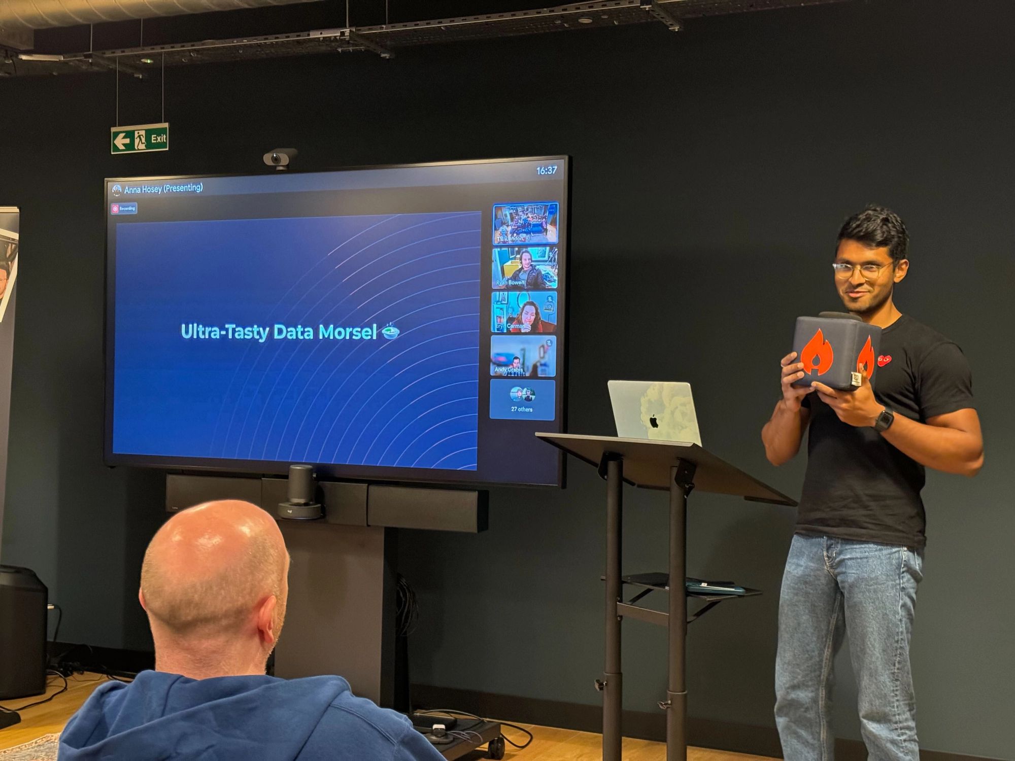
Each week, a member of the incident.io Data team stands in front of the company during our all-hands meeting to present a weekly data insight, affectionally known as the Tasty Data Morsel. As the name implies, the morsel is nothing big or fancy—it is limited to a singular chart on one slide, presented in five minutes or less.
My first data morsel looked at the usage of the CMD+K functionality on our dashboard when I was just three weeks into the job. Since then, I’ve seen our data morsels range from useful facts about our sales velocity to a ranking of the most popular menu choices at the company Christmas party. (It turns out our engineers really don’t like salmon, but they go wild for Beef Wellington.)
Why do we do it?
You might be thinking, these data insights have nothing to do with the rest of the all-hands meeting—don’t you have more important things to discuss?
We always strive to keep all-hands a mixture of business and fun. The Tasty Data Morsel can be either, and is often both! Here’s why we keep doing them, after two years of morsels.
They make us ask questions
Pretend for a moment you work at incident.io (welcome, have some swag!). You may have just seen me present a chart on the number of paused incidents over the past 30 days. As your eyes scan the bars in front of you, it is almost inevitable that you may ask yourself some kind of question about them. Why do users pause incidents instead of closing them? What are those spikes in paused incidents that seem to occur weekly? Why is the graph so aggressively hot pink?
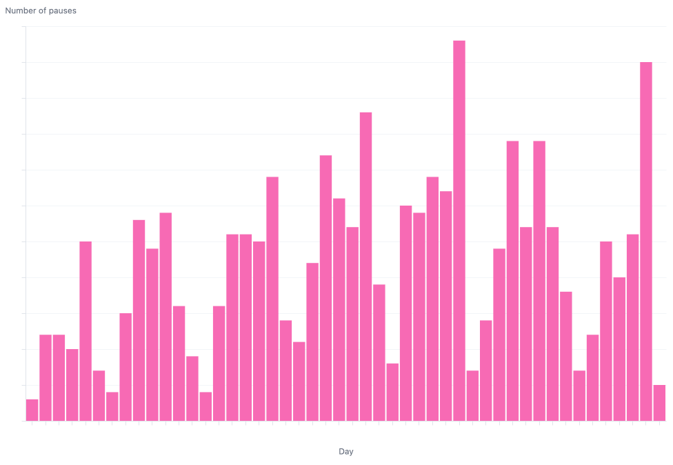
The answer to the last two questions, respectively, is that responders tend to pause incidents on Fridays before they go home for the weekend, and because I really like pink.
However, the first question may stay in your mind. Later, as you log onto our self-serve data tool Omni (more on that coming soon in a later blog), you may decide to find out the answer for yourself.
They make us discover
When you ask questions about the data, you also ask questions about the product. When the questions are answered, these discoveries can change the product for the better.
For example, while investigating the average time to declare an incident, we found that the number of fields in the declare form significantly affected the time to declare an incident. Off the back of this analysis, we implemented a feature that warns our customers when their declare form is getting…unwieldy.
By constantly prodding and poking at the data, we discover little tidbits about our product that can grow into real features. There are a hundred quality-of-life improvements and new ideas waiting in your product, but the only way to find them is to go out into the unknown, into the obscure details, and the less-loved parts of your data.
They are a chance to delight
If it’s not obvious by now, I think data is very cool. That may not be everyone’s opinion, but I’ve seen enough JPEGs of “Britain’s favorite meal-deal combination” with millions of likes and shares to suspect that deep down, most people enjoy a good graph.
But the main reason the tasty data morsel is fun to present is because my colleagues are behind every feature, campaign, or sales win. To be able to tell a story about their work that may not always be visible in the standard company metrics is incredibly fun and rewarding.
They make the data more visible
If you don’t know what data we have, you don’t know to ask for it. You might be sitting on a ton of questions about your product yet mistakenly assume that we don’t have the means to answer them. By presenting insights weekly, everyone in the company has a better understanding of what it is possible to do with data.
It is also a chance for your Data team to remind everyone that they are there to help you. If you have to see us every week, you will (hopefully) also think of us next time you wonder how many incidents are declared between 2 am and 4 am.
In conclusion
One year and thirteen tasty data morsels later, I still remember my first morsel. The axis labels were too small, I was using the default color scheme, and I still remember the butterflies while grabbing the microphone from our MC to present on our all-hands.
Apart from the benefits the Tasty Data Morsel brings to the company, it’s also had a positive impact on me as a data professional. Looking for a fun insight to share each month forces me to think outside the box, and search for stories in unexpected places. The practice of fitting a complex insight into a single chart has made me better at data visualization, and standing up in front of my peers every month has definitely made me a less nervous public speaker.
Some of our morsels grow into ideas that change the product, and some just make us smile. I can’t wait to see how this year’s Christmas party choices compare to last year’s.

Matilda Hultgren
Data Analyst
See related articles

Pager fatigue: Making the invisible work visible
We developed The Fatigue Score to make sure our On-call responders’ efforts are visible. Here's how we did it, and how you can too.
 Matilda Hultgren
April 25, 2025

Going beyond MTTx and measuring “good” incident management
What does "good" incident management look like? MTTx metrics track speed, but speed alone doesn’t mean success. So, we decided to analyze 100,000+ incident from companies of all sizes to identify a set of new benchmarks for every stage of the incident lifecycle.
 Chris Evans
March 25, 2025

How we handle sensitive data in BigQuery
We take handling sensitive customer data seriously. This blog explains how we manage PII and confidential data in BigQuery through default masking, automated tagging, and strict access controls.
 Lambert Le Manh
November 14, 2024
So good, you’ll break things on purpose
Ready for modern incident management? Book a call with one of our experts today.
We’d love to talk to you about
- All-in-one incident management
- Our unmatched speed of deployment
- Why we’re loved by users and easily adopted
- How we work for the whole organization


