Pager fatigue: Making the invisible work visible
April 25, 2025 — 10 min read

As much as you try to prevent it, your product will break sometimes. While you hope it would have the decency to do so while you are awake and already working, sometimes the product is inconsiderate and decides to break outside your office hours.
Being woken up from a page at 3 am sucks, and being woken up again two hours later (when you get pinged for a follow-up issue you missed the first time) sucks even more. When you log into work the next day, bleary-eyed and clutching a coffee, you’d hope that someone has noticed your hard work. Maybe you’ll even message your manager and let them know about the rough night you had.
But imagine that before you say anything, your manager messages you first.
“Hey! I saw you had a terrible night. How are you feeling? I can take you off the pager today, and we’ll organize for someone to cover you.”
At incident.io, we use our own product. Our engineers get paged, and they work on incidents, and just like any engineer on-call, they get pager fatigue. While we cannot control when and how things break, we can make sure our responders’ efforts are visible. It is with this purpose in mind that we developed The Fatigue Score.
Why track fatigue?
Fatigue or “readiness” plays a huge part in many disciplines – anyone in the Health or Emergency services will be familiar with alert fatigue, and the many tools made to track consecutive shifts or workload intensity.
The Fatigue Avoidance Scheduling Tool (FAST) was developed to reduce pilot fatigue, increasing aviation safety and minimizing the risk of human error. Nuclear stations have stringent rules on work hour limitations and fatigue assessment requirements, while the oil and gas industry may employ alertness tests before shifts. All in an effort to minimize the risk of fatigue impacting performance when lives are at stake, but also to protect staff.
Alert fatigue is one of the many concepts that Software incident management share with these domains (alongside triaging, severity levels, first responders etc…). While a bug in our systems is hopefully not as catastrophic as a nuclear reactor emergency, we also want to make sure that our responders are ready to take on the day, and keep coding errors to a minimum.
What does the fatigue score look like at incident.io?
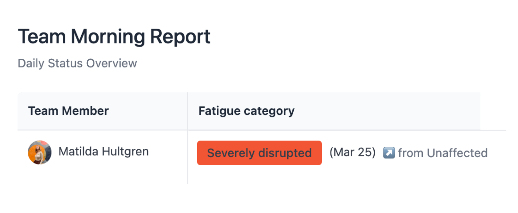
Every day, we surface a dashboard known as The Morning Report in our team channels. This is the same data that is available in our Insights product, with one major difference: There is an added field called the Fatigue category.
The image below shows an example of such a report. Each row shows the fatigue score at 7am (when our pipeline runs), and all activities that contributed to that score across the past 24 hours. As you can see, one responder has had a bad night on the pager, and worked on incidents for 3 hours the day prior.
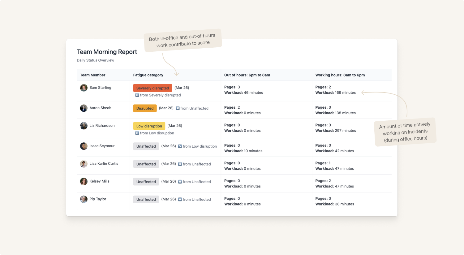
The fatigue category shows in which state a responder is coming into work that morning. All activities such as overnight pages, working on Major incidents, and working overnight are rolled up into a final score, which is then given a grade:
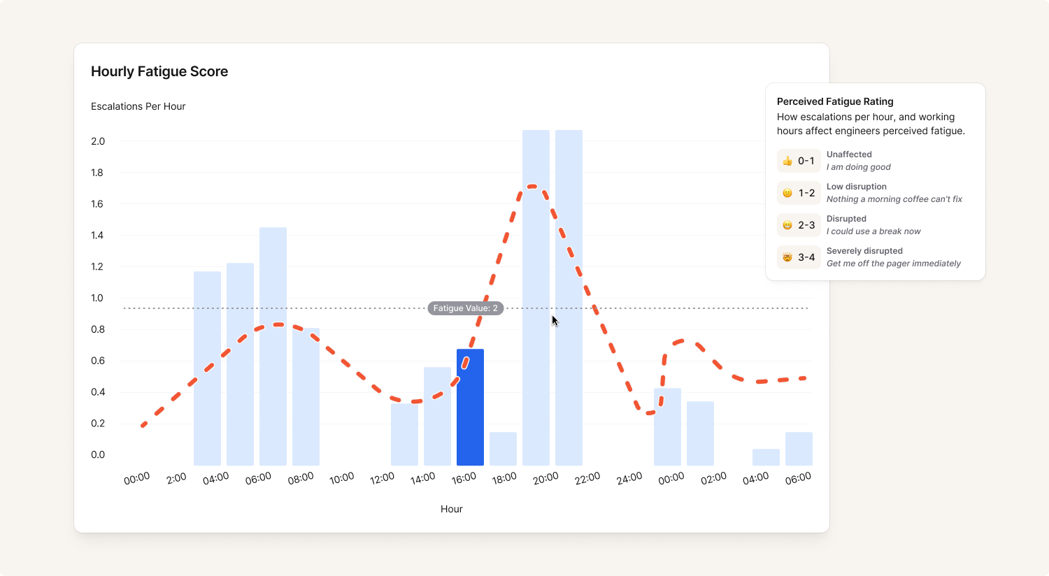
- 0-1: Unaffected (I am doing good)
- 1-2: Low disruption (Nothing a morning coffee can’t fix)
- 2-3: Disrupted (I could use a break now)
- 3-4: Severely disrupted (Get me off the pager immediately)
Think of your local public transport disruption board, but for engineers.
Building the fatigue score
How does one go about building a score like this, and make sure it accurately reflects how the engineers are feeling?
Unfortunately for the department, it involved this author bothering the engineers. A lot.
The first phase was doing a set of user interviews. What makes a night on the pager disruptive? What times are the worst? How does it feel if you get paged during the day?
Each engineer suggested a set of variables that they believed affected their pager fatigue. Being paged at night was obviously bad, but being paged multiple times in one night was much worse. The amount of work spent on an incident also played a huge part in how tired the engineers felt the next day.
Armed with this knowledge, I got to work.
In the second phase, I collected a chart of all of the pages they had received in the past seven days, and asked them to draw their perceived fatigue out, overlaying the graph. The emerging patterns looked similar to what I had been told previously: Multiple pages on the same night are bad. While fatigue goes down over time, being paged multiple nights in a row stacks exhaustion.
Eventually, after adjusting the scores back and forth for a few days, we were starting to approach a breakthrough.
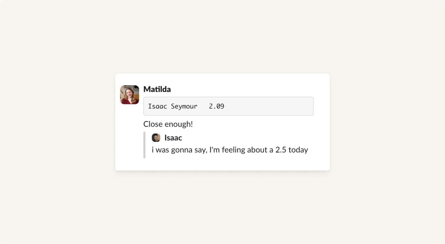
In the third phase, it was time for fine-tuning. Each morning, I would check on the fatigue score model that had run overnight. If I saw that anyone had scored medium or high, I’d send them a Slack message and ask them how they were feeling “on a scale from 1 to 4”. When they weren’t responding with “it’s too early for this, Matilda”, they would say something like “maybe a 2.5, or a 3”.
Then, I would check their perceived fatigue against the calculated score. If it was too low, perhaps the workload wasn’t contributing enough to the calculations. If the total score was too high, maybe overnight pages needed to be toned down a bit. 100% accuracy was not the aim. The important thing was that the score was consistently proportionally and directionally correct.
After a few iterations of this process, the score was accurate enough that it was time to surface it to the rest of the organization. After building a carefully color-coded dashboard (using our BI tool Omni), I set up a scheduled delivery of the full report (one score per responder, per team) to our teams’ Slack channels every morning at 9 am.
Using the fatigue score
Now we know the state of pager fatigue that each responder starts the day with, and how their previous 24 hours on the pager have looked. So, what do we use this knowledge for?
1. Adding visibility for EMs
EMs only need to glance at the report to know which engineers are coming in fresh, and which ones are… not. It offers them the ability to proactively reach out at the start of the day, to check in with team members who might have had a rough night. If the team was dealing with a major incident overnight, it might also affect their availability to work on other projects during the day, which the EM would need to address.
Incident workload time and pages also allow EMs to spot if someone who was not on the pager has been involved in incidents. Perhaps they have been pulled in from another team to help out with an issue? Was there a cross-organizational incident that needs to be looked at?
Finally, it allows them to see the full scope of the incident workload. Going into a stand-up knowing that the engineers spent a combined 6 hours on incidents yesterday could explain why projects are delayed, and the team can plan accordingly.
2. Adding visibility for… everyone!
When the going gets tough, it’s nice to know that your team has your back.
Colleagues outside the Product department may not fully understand what it means to be on the pager, but a red siren flashing next to someone’s name is a language everyone can understand.
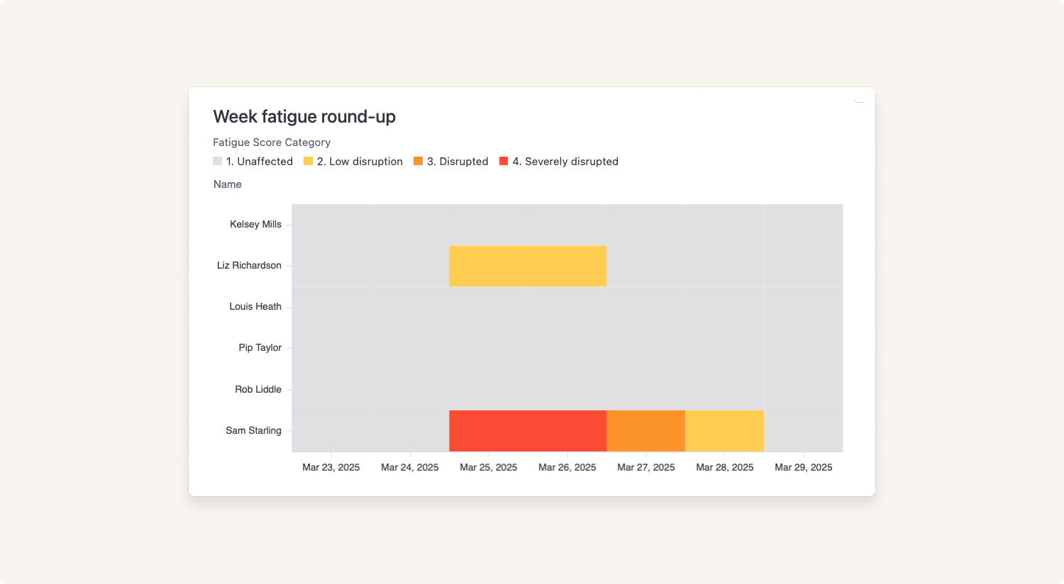
3. Visualizing fatigue over time
Every week, we send a round-up report, showing which users have been in the fatigue zones throughout the week.
By having visibility into a team’s fatigue over time, the team can flag when the bad days are getting worse or more frequent. Previously, the teams have needed to rely on vibes - now, they can slap down a report on the desk and point at a week-by-week increase in red days.
Beyond the fatigue
Obviously, a fatigue score is only an indicator, not an exact science. It does not have the final say in who should be on-call; a responder can need a break from the pager for a variety of reasons. Sometimes you just have a terrible night’s sleep despite all your best efforts. (Yes, we have all made the joke about hooking the sleep data up to the fatigue score.)
Connection to sleep-tracking devices when?
Just pull my Apple Health data already
Pager fatigue is not the same as regular fatigue. But the fatigue score is there to start a conversation between an EM and their team. It’s giving a voice and a visual to a vibe, so that the team can articulate how they are feeling about their workload that day. It is highlighting the sometimes invisible work and effort that goes on overnight, and out of hours.
Because, if you single-handedly saved Production overnight, wouldn’t you wish everyone knew about it?

Matilda Hultgren
Data Analyst
See related articles

Going beyond MTTx and measuring “good” incident management
What does "good" incident management look like? MTTx metrics track speed, but speed alone doesn’t mean success. So, we decided to analyze 100,000+ incident from companies of all sizes to identify a set of new benchmarks for every stage of the incident lifecycle.
 Chris Evans
March 25, 2025

How we handle sensitive data in BigQuery
We take handling sensitive customer data seriously. This blog explains how we manage PII and confidential data in BigQuery through default masking, automated tagging, and strict access controls.
 Lambert Le Manh
November 14, 2024

How we model our data warehouse
Curious about the inner workings of our data warehouse? We’ve shared a lot about our data stack, but this time we’re diving into the design principles behind our warehouse. This blog breaks down how we structure our data, from staging to marts layers, and how we use it all in our BI tool. It’s a quick look into how we keep things flexible, efficient, and built to scale.
 Jack Colsey
November 8, 2024
So good, you’ll break things on purpose
Ready for modern incident management? Book a call with one of our experts today.
We’d love to talk to you about
- All-in-one incident management
- Our unmatched speed of deployment
- Why we’re loved by users and easily adopted
- How we work for the whole organization


