Behind the curtain: figuring out a gnarly user experience
December 5, 2023 — 5 min read

We recently shipped Configurable Forms which introduced the ability to control the layout and content of your incident forms in a single place. In this post, we’ll take a look behind the curtain at the process we went through to build a really great editing experience for our users.
We had two key goals for the project:
- Introduce more configuration options, to help users tailor forms to their specific needs (e.g. default values, customised helptext, dividers etc.)
- Make it easy for users to understand what the form will look like while they’re configuring it, so that forms don’t get too long
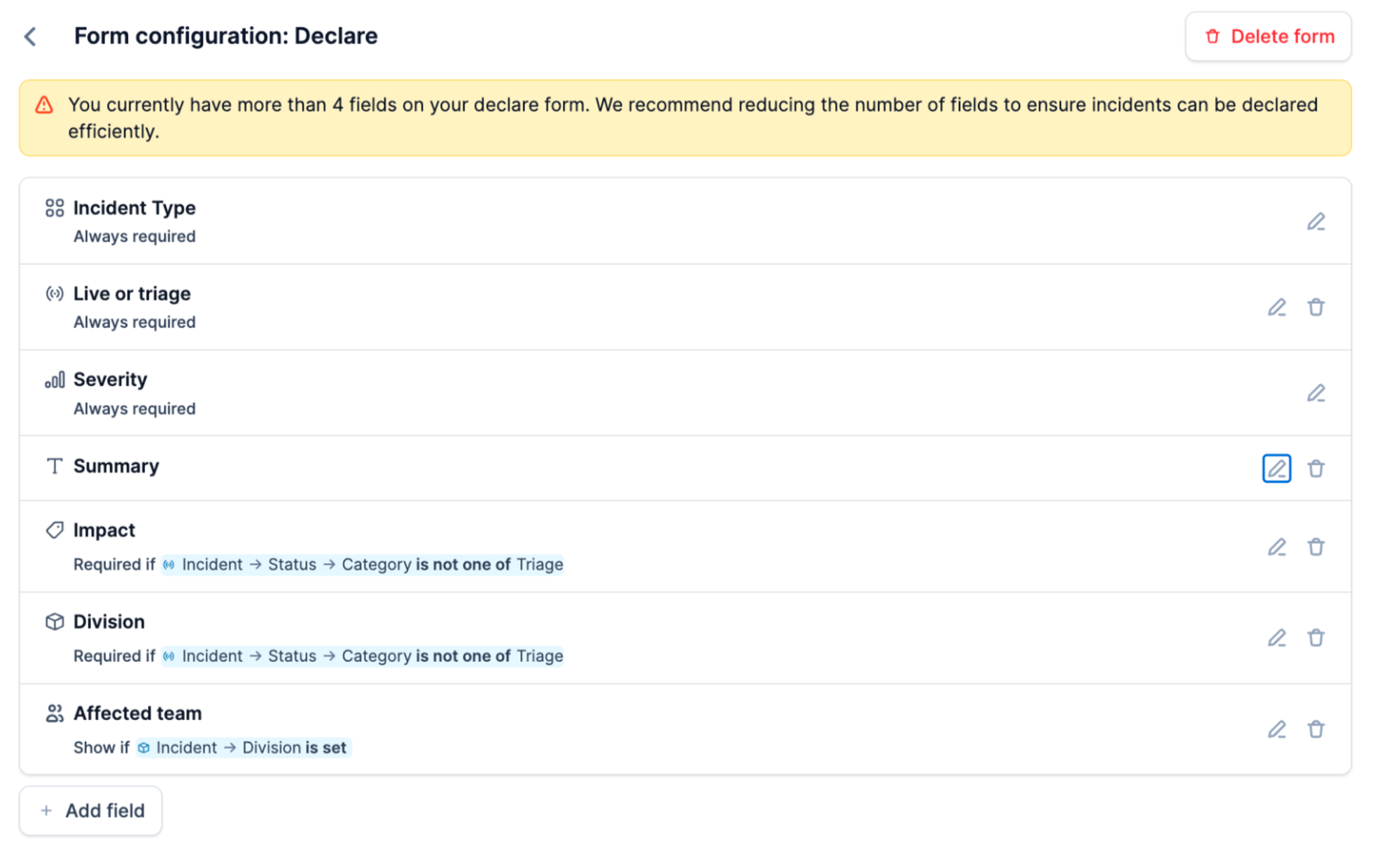
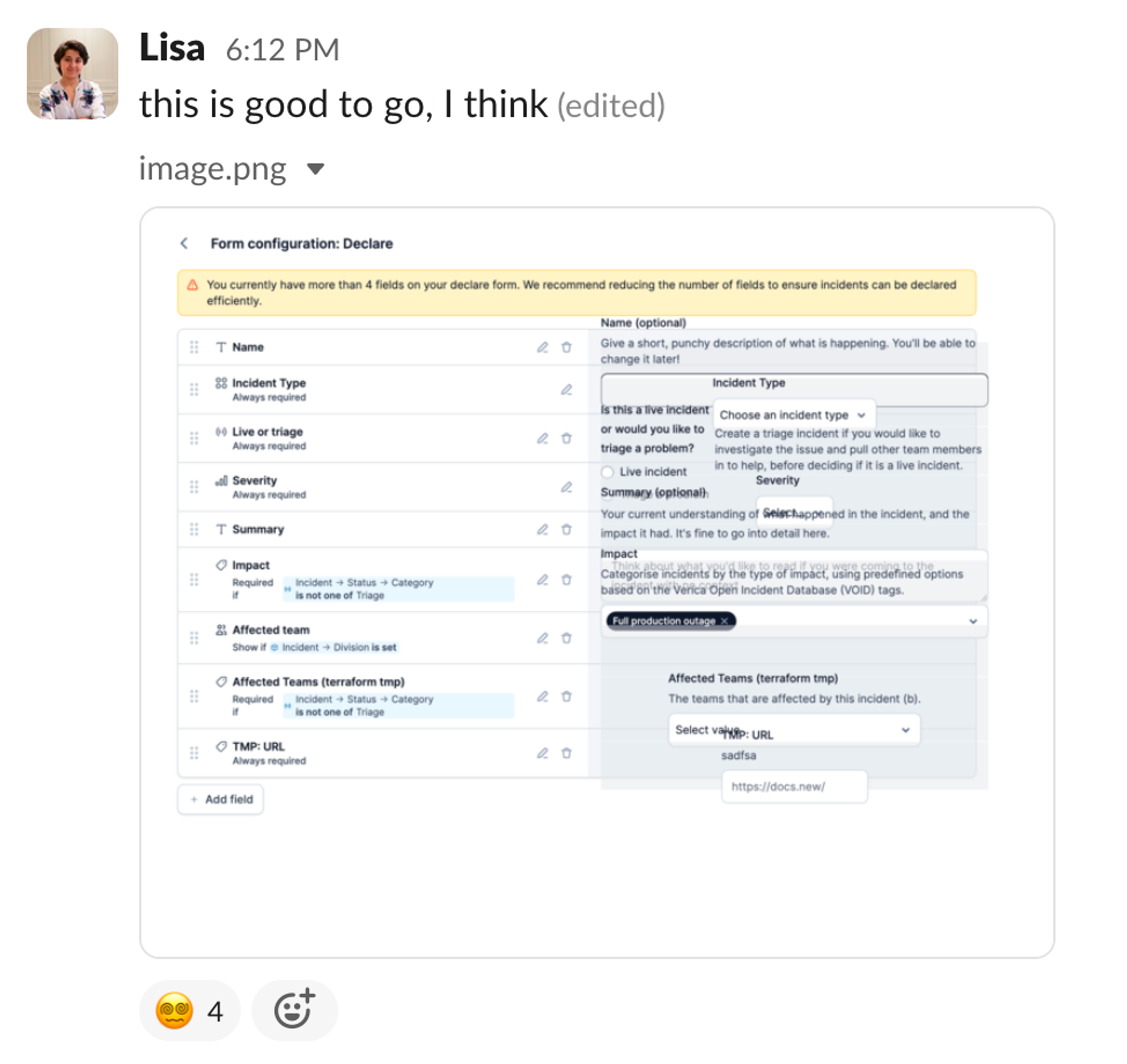
We started by focussing on problem 1, and built a UI that enabled us to access all the different configuration options. Each row in this list represents a different form field (e.g. a text input or dropdown). You could use the ‘edit’ button to edit the specific configuration (e.g. when a field is hidden or when it’s required).
At this point, we’d shipped the feature to a few customers as part of a private beta to get some feedback, as well as starting to dogfood it ourselves.
Once we were happy with this, we turned our attention to problem 2. How can we build a UI where you can understand the impact of the changes that you’re making while you’re making them?
Iteration 1: a separate preview
When we’d scoped the project, we assumed we would want some sort of preview of the form. We do this in a few other places in the app: for example when configuring your announcement post.
So we put a preview in a grey box underneath the list of form elements, and included a preview of the form. Simples.
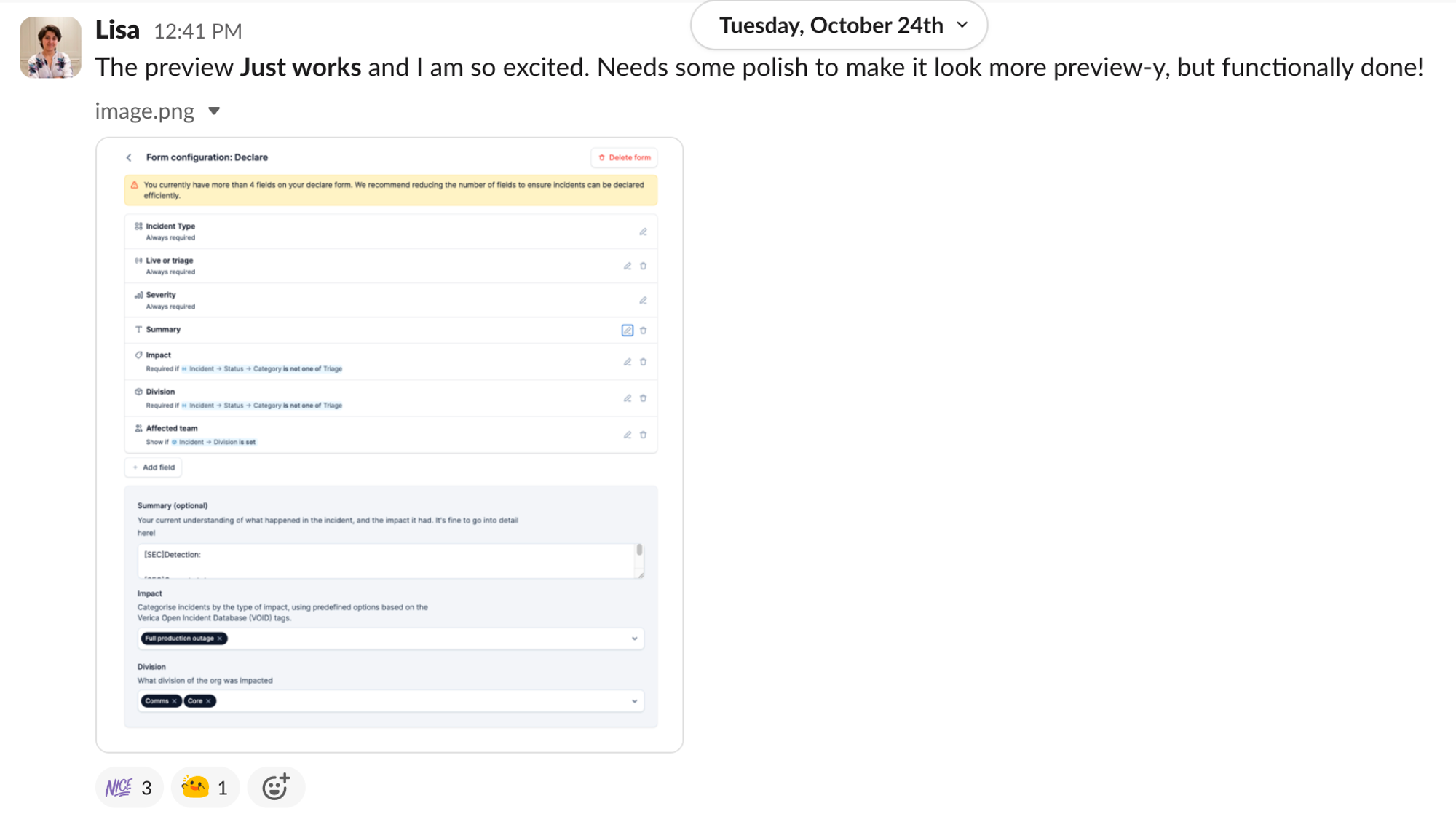
We then had a chat about interactivity: should you be able to actually use the dropdowns and text boxes in the preview? We decided that yes, let’s make it interactive
Iteration 2: can we inline the preview
Sam Willis (a.k.a. swillis) is one of our excellent product designers. You’ll soon notice that this blog post is in fact mostly a letter of admiration for his work.
In some projects, design are involved from the very beginning and work with the team to build designs before we start building the UI. However, for this project we decided to bring Sam in much later so that he could prioritise some other high priority work.
Once I had my first pass, I walked over to his desk to see if I could pick his brains about how we could improve the UI we’d built.
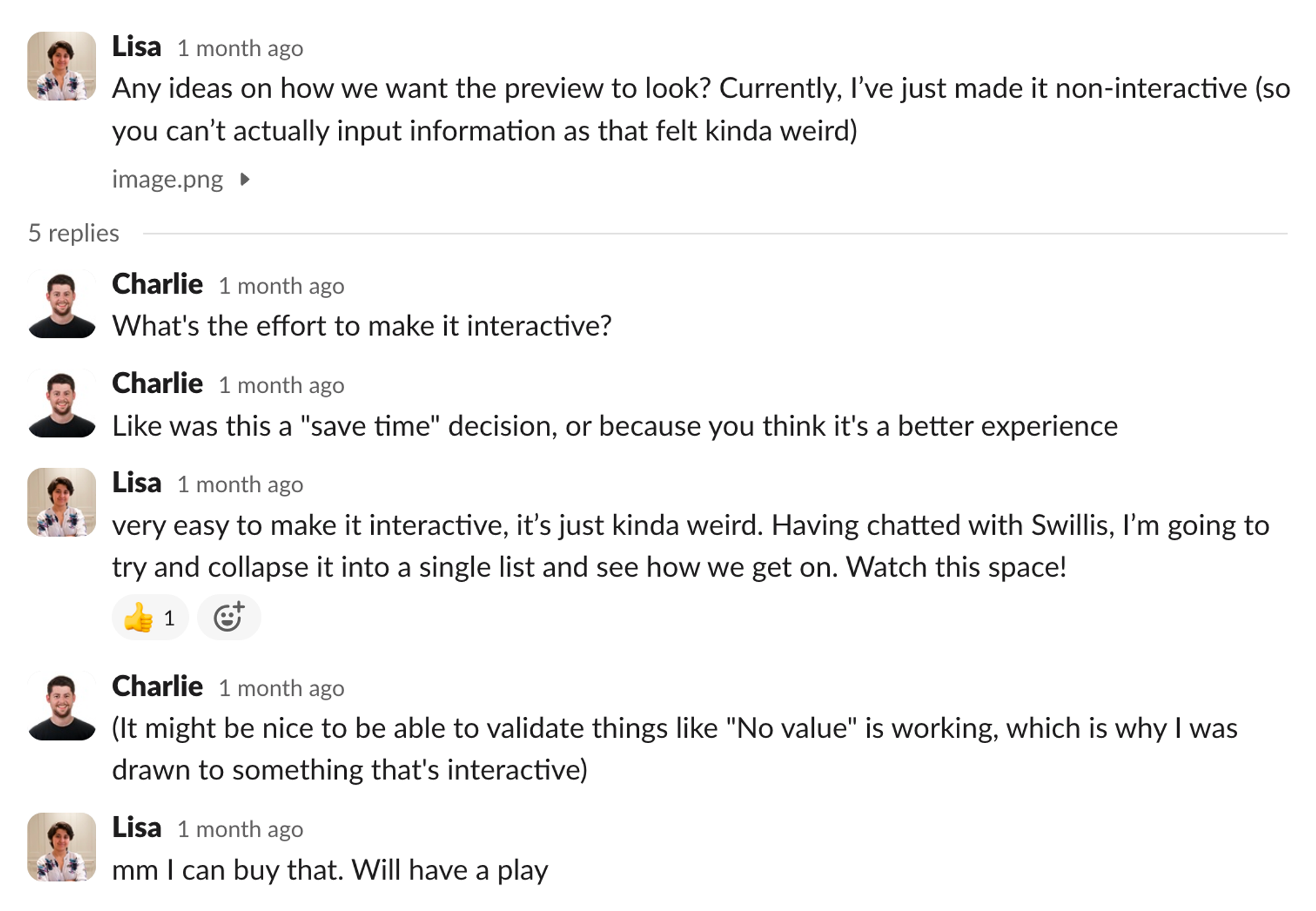
We felt that our current preview was quite disconnected from the form, and particularly for forms with lots of elements, it was hard to understand the relationship between the two. So we agreed that it was worth me spending some time trying to ‘inline’ the preview.
My first attempt wasn’t quite right (love some dodgy CSS)
But by the end of the afternoon I had a few different options, and we settled on option 1 and shipped it.
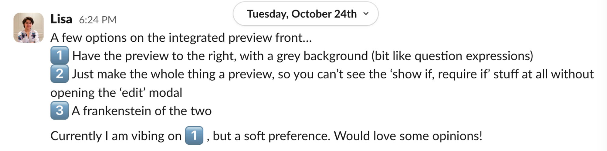
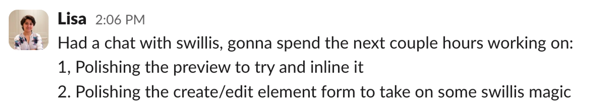
Iteration 3: The polish party
We use polish parties as a way of gathering feedback from people outside the project team, and helping us identify those magic touches that take a product from being good to being great.
In the polish party, we look at this integrated-preview UI, and decide that we don’t quite like it and want to take another run.
We start talking about making the preview part of the form be styled like a Slack modal, so it feels clearer that you’re in a of ‘what-you-see-is-what-you-get’ style UI.
We draw something on a whiteboard (I don’t have a picture, sadly) and Sam agrees to mock-up something quickly in Figma for us to try and work towards.
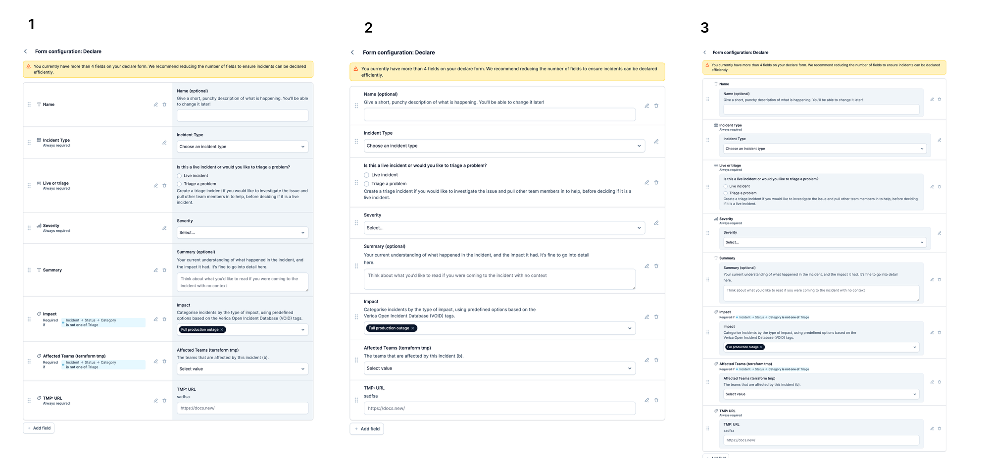
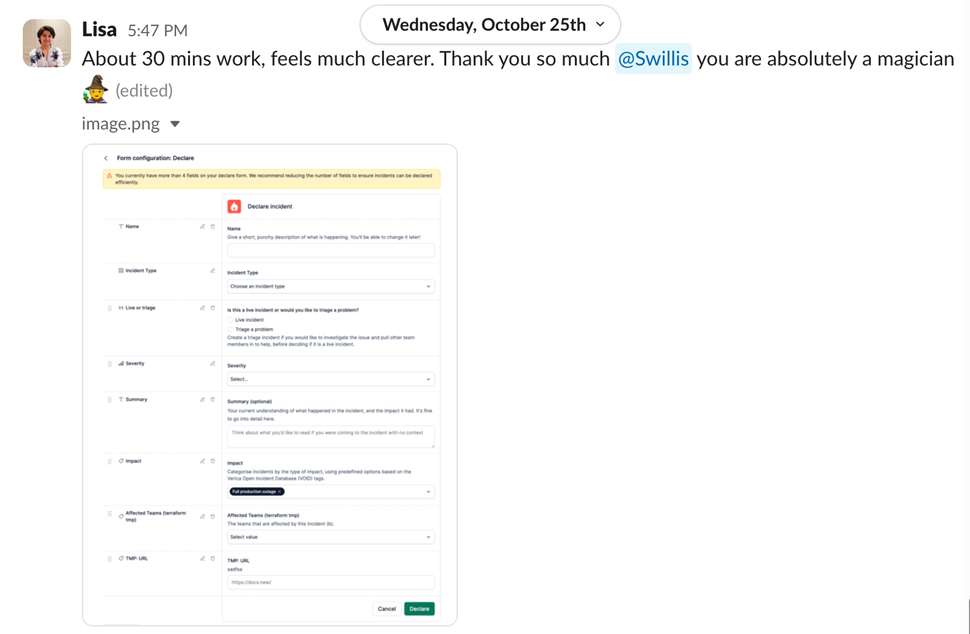
About 30 mins later, Sam shares his idea:
And then a little later, I ship the updated design:
BUT there was something nagging at me. And also, conveniently, at my teammate Sam Starling (I can only apologise that almost everyone in this story is called Sam).
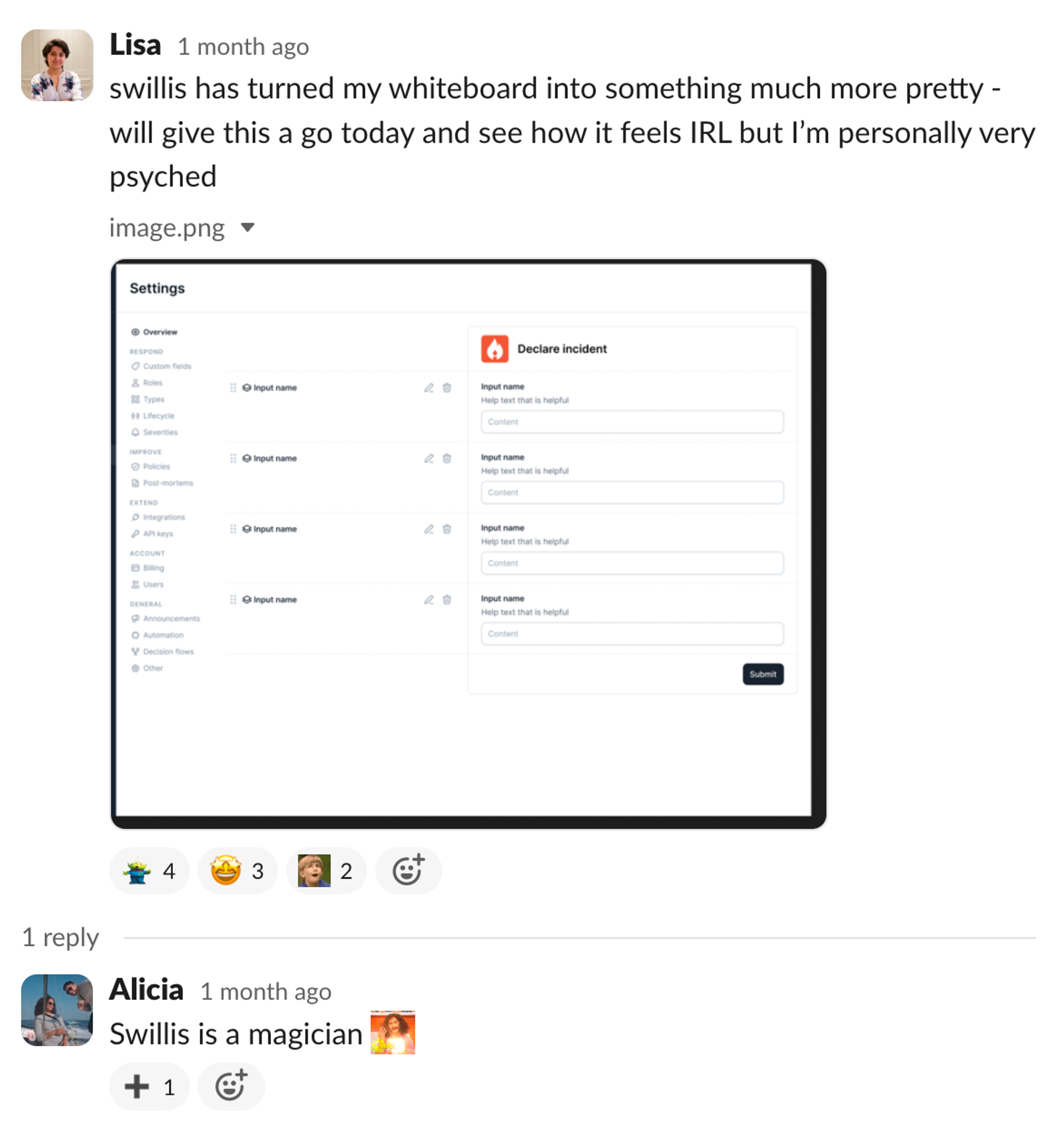
Iteration 4: The finished product (for now)
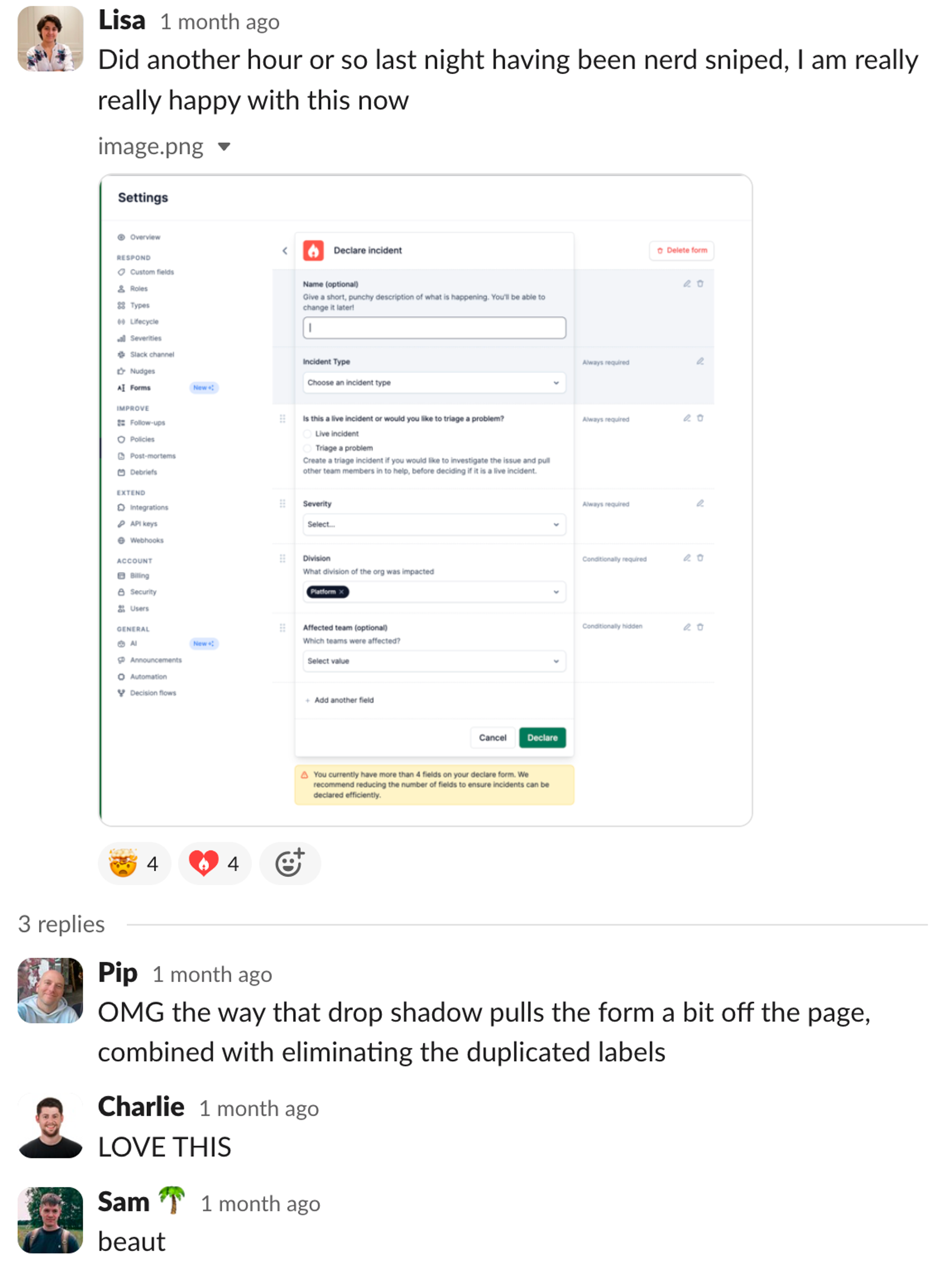
As Sam Starling suggested, I tried dropping the field names all together, and relying just on the form preview itself to help you understand what you’re adding and removing. As well as adding some very heavy drop shadow to help separate the form preview from the rest of the UI. Job done.

Lisa Karlin Curtis
Technical Lead
See related articles

How we achieved pixel-perfect polish during our Status Pages launch
When we launched Status Pages, we wanted to challenge industry norms and push our design polish to new levels. As an engineering team, here's how we worked with our design team to make this happen.
 Dimitra Zuccarelli
July 13, 2023

How our engineering team uses Polish Parties to maintain quality at pace
In a fast-moving company, quality cannot be delegated to a few individuals—it has to be a shared responsibility. One tool that helps us maintain our quality of work is Polish Parties. Here's how we run these crucial feedback sessions.
 Leo Sjöberg
July 14, 2023

Breaking down complex projects into smaller, shippable increments
Mitigate the risks of delivering a complex project by shipping small pieces along the way.
 Lisa Karlin Curtis
December 14, 2021
So good, you’ll break things on purpose
Ready for modern incident management? Book a call with one of our experts today.
We’d love to talk to you about
- All-in-one incident management
- Our unmatched speed of deployment
- Why we’re loved by users and easily adopted
- How we work for the whole organization


