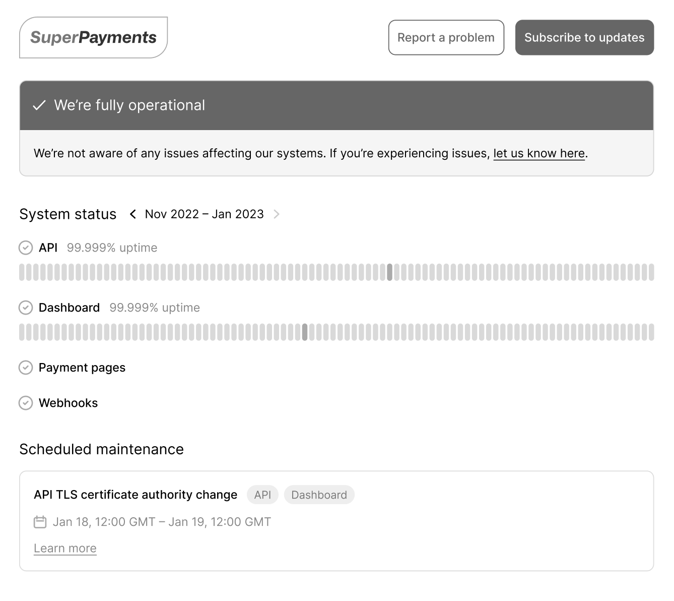
How we achieved pixel-perfect polish during our Status Pages launch
July 13, 2023 — 10 min read

A few months ago, we released Status Pages. This project was quite different from anything we’ve approached before, given that:
- The users of the page are not our customers, but our customer’s customers
- The audience of the status page is much wider, which means an opportunity to introduce new prospects to our product. In short, it’s a chance to make a good first impression
- The codebase was completely new, so we had the option to branch away from our existing dashboard and do something a little different
And our goals were a departure from one's we had set in the past:
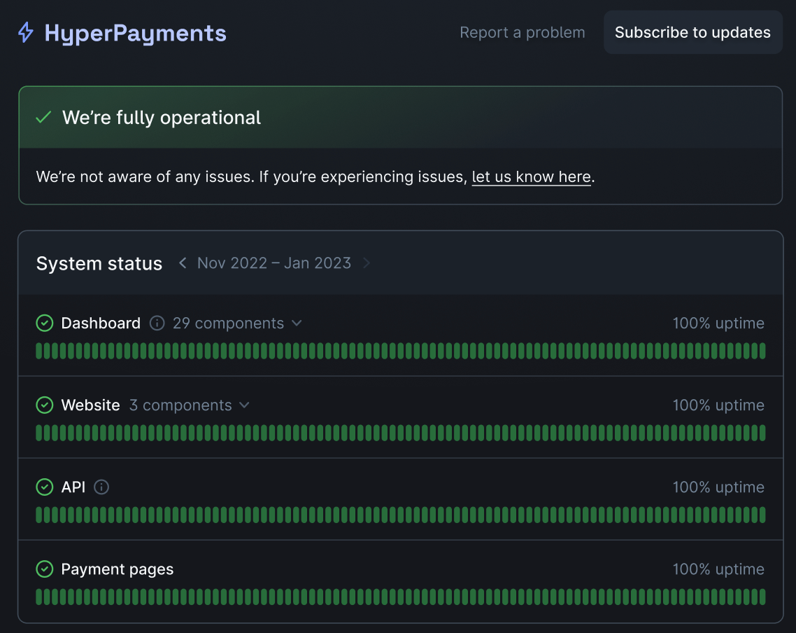
- We wanted to challenge industry norms and create the most effective, easy-to-use, and beautiful status page on the market
- We wanted to put a lot of effort into pushing our polish and design to new levels
With this in mind, we worked closely with our designer throughout the process of building Status Pages. Here is how we approached it and a few lessons we learned along the way!
Building alignment
With only one designer across three engineering teams, we have to use design time effectively.
As product engineers, we expect to be able to take a pretty good stab at things alone, bringing in design at the end for final feedback and visual tweaks.
However, given the high level of polish we were aiming for with this project, it made sense to get our designer, James, involved much earlier in the process. We wanted every detail to be well thought-out.
Like with any greenfield product, the path forward wasn’t entirely clear, and figuring out the unknowns was the first step forward (but arguably one of the most fun).
And it was up to the team to conduct market research, talk to customers, decide what we wanted to build, and work together to determine the best way to get there.
Brainstorming
Before the aesthetic design of the product was considered, we wanted to lay down a few pillars of its structural design.
Status pages are a relatively well-known concept, and there’s an expectation around what people expect to see when they first land on one.
While we wanted to make sure that we stuck to this a bit, we had a few ideas about how we could improve our user experience.
Firstly, we brain-dumped everything we wanted to build.
We had several whiteboarding and brainstorming sessions involving engineers, our product designer, product and engineering managers, and CTO. By the end of the week, we were confident we were all on the same page about what we wanted to build and how we would model it.
Lo-fi designs
While engineering started laying the foundations and building up the infrastructure to host our Status Pages, James worked on some lo-fi wireframes, which included all of the initial features we aimed to launch and everything we had discussed in our initial brainstorming sessions.
Very importantly, none of the wireframes were a surprise when we first saw them.
This phase was highly collaborative, and at very regular intervals, James would send over Figma designs for feedback, share his thoughts, get opinions on choosing between multiple designs, and so on.
All of this happened asynchronously via our team’s Slack channel, meaning anyone could jump in anytime.
A shared vision
It’s worth pausing here to mention that knowing what you want to build is important, but knowing how you want to build it is arguably just as essential.
Although we didn’t exactly frame them as values at the time, I think that would be the best way to describe the “guidelines” we gave ourselves as a team from day one—a shared frame of reference that informed our decisions and priorities.
For example, one thing we were set on from the start was ensuring updating the public status page felt as safe and as straightforward as possible.
Another value (that I’m sure you’ll be shocked to find out) was to ensure everything public facing would maintain a high bar of polish.
If the feature affected the public status page, we made sure we had design sign-off. If it was confined to a dashboard, we’d go ahead and have a go at the design ourselves.
Design partners
One of my favourite parts of being an engineer at incident.io is our relationship with our customers.
Talking to them and getting their input on things we’ve built is always a highlight, and we knew we wanted to leverage this when building Status Pages.
We chose three clients we knew were interested in an incident.io Status Page, whose general design preferences aligned with ours and whose feedback on existing pain points with status pages could help us build the best product.
Having external stakeholders validate the assumptions we had made up until this point was fundamental to the early decision-making of the product. As we developed and iterated, we also made sure to lean on them for feedback along the way and used this to prioritise our backlog.
Synchronous collaboration
Two months, many matchas, and a few product socials later, we had a barebones Status Page product we were ready to run with.
The designs had been implemented quite roughly, but the functionality was there, and for all intents and purposes, it was a status page.
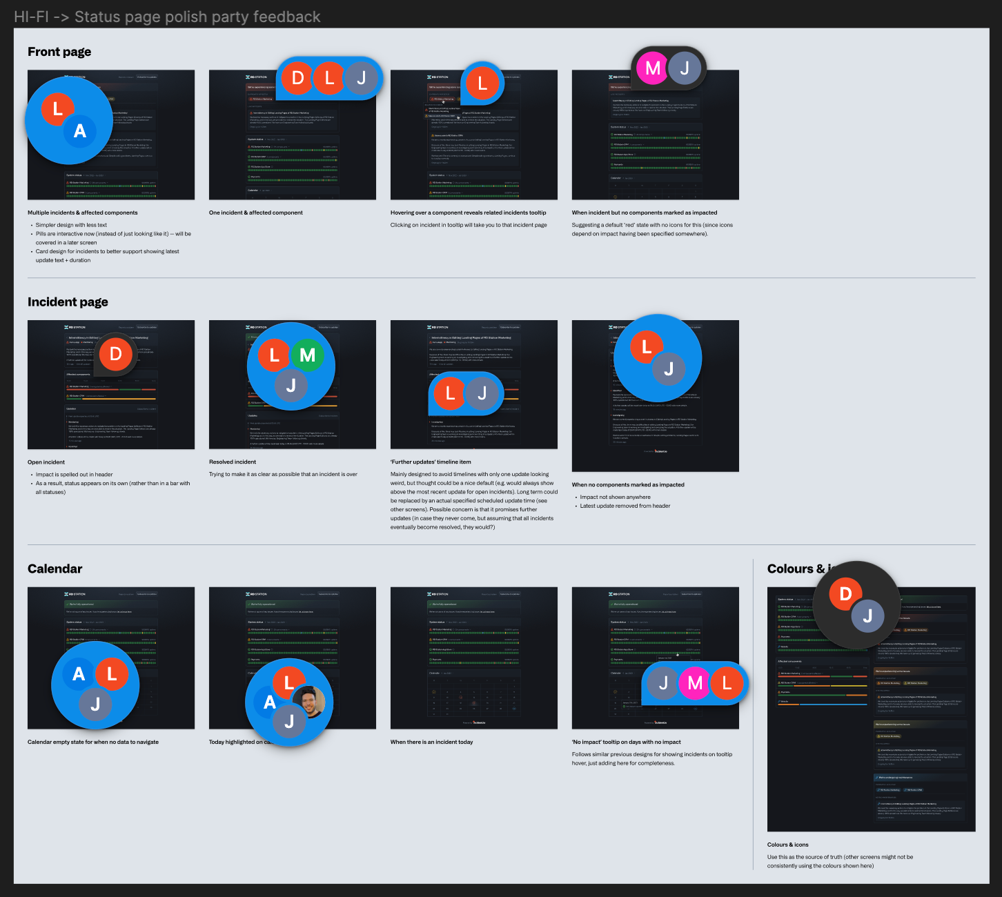
At this point we were ready to really fine-tune the design and user experience of what we had created. James did a lot of thinking, and came up with a set of higher fidelity designs to present both internally and externally to our design partners.
Synchronous collaboration was a lot more useful here—we were now getting down to much finer details, and the overall user experience flow was something that made sense to walk through and break down together.
It isn't personal
But there’s definitely a balance to be struck here.
We had all been knee-deep in Status Pages for the past two months, and we had been very close to the both the design and the implementation. When someone new comes in and disagrees with something you’ve worked on, its probably quite easy to go on the defence, as an initial knee-jerk reaction.
I think this is something we do really well to combat at incident.io.
We all know that the criticism or feedback isn’t personal. We want to make the best product possible, and being able to quickly pivot when a better idea comes up is all par for the course. “Strong opinions loosely held” is what we aim for.
Design pairing
One of my favourite parts of the entire Status Page launch was sitting down with James over several days and multiple sessions, pairing on the public status page.
We went through every gradient, border and heading and made sure it looked as good as it was ever going to look. We added animations, refined tailwind classes, and by the end of it we had something we were really proud of.
The page looked good before, but these final tweaks are what really brought it to life.
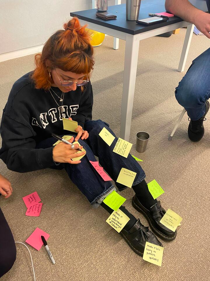
Holding a Polish Party
Once each portion was finished and polished to a reasonable level, we would hold what we call a Polish Party.
The idea behind Polish Parties is to dedicate a small bit of time to getting everyone in a room, going through a key flow (for example, setting up a new status page or publishing an incident to a status page) and making sure we’re happy with both the design and the user experience.
The goal for the Polish Party is to get more eyes on the final designs, including people who have context but have not seen what we’ve been building.
This is valuable outside perspective since, as stated before, we’ve been much closer to the product.
If something isn’t clear to a non-team member during the Polish Party, it gives us a pretty good signal into how an end user might perceive it, too.
It’s an indication that there’s something there to adjust, and during the Polish Party we try and dig into what exactly that something is.
Things we look at in this phase might include:
- Making sure the user experience feels right. We might update flows, move pages around, and update calls to action, just as an example. We want it to feel intuitive, and this is something we try to optimise for polish
- Making sure all of our copy makes sense, is clear, and is in the right tone of voice
- Update small design elements, such as colours, buttons, icons and so on
The items from the polish party are actioned immediately after and at that point we’re usually ready to ship that portion of product.
Polish makes perfect...pixel-perfect
As much as we put in a lot of care into optimising each part of the design and product development process, there are naturally things that may go overlooked.
Before moving on to the next big project, we might pick up smaller items to allow us time to address any feedback that comes in when clients actually start using what we’ve built.
This is always the best feeling and usually generates quite a bit of hype from the team. Jumping straight into addressing comments and shipping fixes or improvements as quickly as possible definitely gives us a nerdy high.
Releasing Status Pages was a huge feel-good moment and something we were all really proud to shout loudly about. We’re all very much set on holding ourselves to the same bar going forward, while following the same principles we did during our launch:
- Early and iterative feedback with design partners and clients
- Close, iterative collaboration with our design team. Nothing is done in isolation and thrown over the wall to the next team to catch - everyone has equal contribution at every phase
- Not being precious about what we’ve built, being able to pivot quickly when something can be improved
- Making decisions according to our team guidelines/values. These are likely to change over time and as the product grows and changes, but the important thing is the entire team has the same point of reference they have agreed upon (together!)
By doing all of these, we can ensure that we get the polish we're looking for every time.

Dimitra Zuccarelli
Product Engineer
See related articles

Announcing incident.io Status Pages — powering clear external comms to build trust
With Status Pages, businesses can once again make external comms a staple of their company culture.
 Luis Gonzalez
April 18, 2023

How we built it: incident.io Status Pages
How we a built fast, reliable status page solution in three months.
 Isaac Seymour
April 19, 2023

Breaking down complex projects into smaller, shippable increments
Mitigate the risks of delivering a complex project by shipping small pieces along the way.
 Lisa Karlin Curtis
December 14, 2021
So good, you’ll break things on purpose
Ready for modern incident management? Book a call with one of our experts today.
We’d love to talk to you about
- All-in-one incident management
- Our unmatched speed of deployment
- Why we’re loved by users and easily adopted
- How we work for the whole organization


