New: AI-native post-mortems are here! Get a data-rich draft in minutes.
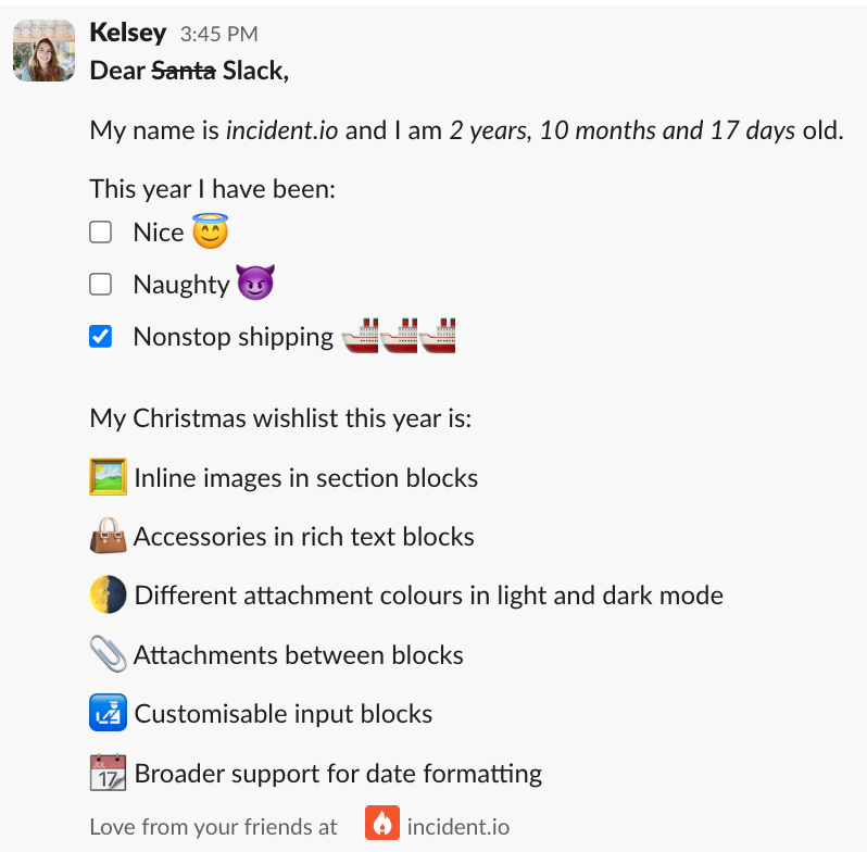
All I want for Christmas... from Slack

When declaring and responding to an incident with incident.io, most of your interactions with our product will go via Slack. You might configure your forms in our web dashboard, but the responder using them to declare an incident is most likely doing so from a Slack modal, and the incident announcement will be posted as a Slack message.
This means a lot of our product design falls within the constraints of what we can build using Slack’s block kit. You can read more here about our development process for working with the framework.
It’s an extremely flexible framework, and we’re proud of the messages and modals we’ve put together with it. However, there’s always more we could ask for, so here’s our Christmas wishlist to you, Slack.

🖼️ Inline images in section blocks
As part of our recent improvements to our Slack messaging, we now include more images in context blocks, for example:
- The profile picture of the user who updated the incident
- The logo of the integration provider when an attachment is added
- An icon representing the severity of the incident
They look great, and make it easier to take in useful context at a glance.

We’d love to be able to include inline images like that in section and rich text blocks as well, giving us greater flexibility to use avatars, logos, and anything emoji-like that’s custom to our product, anywhere in our messaging.
👜 Accessories in rich text blocks
Up until very recently, rich text blocks in Slack were at the top of our wishlist, and this year they delivered. 💝
We have now switched to rich text to capture the details of an incident in the summary or update, so our users have the flexibility to format their messages as clearly as possible. You can read more about it in our changelog.
We’d like to use this feature more widely, but unfortunately Slack doesn’t yet support accessories in rich text blocks. That means for example, that we couldn’t use an overflow menu like this on a message with rich text.

🌗 Different attachment colors in light and dark modes
Attachment color bars can provide useful extra context to the attachment, for example highlighting which actions have been completed.


Slack provides light and dark themes, and when you use Slack’s set of default colors as in the example above, the hues are adjusted accordingly.
While you can also set a custom bar color using a hex code, currently you cannot conditionally set it based on the user’s current theme. That means a purple that would pop in light mode fades into the background in dark mode, limiting the usefulness of setting the custom color.
📎 Attachments as standard blocks
While we’re on the subject of attachments, they’d be even better if we could use them as a standard block type anywhere in the message rather than always displayed at the end.
As heavy users of the block kit builder to design and iterate on our content, supporting messages with attachments in the builder would also be much appreciated!
🛃 Customisable input blocks
Slack provides us with blocks to add checkboxes and radio buttons to our forms. In the case of checkboxes, we can add some description text along with each item’s name.
Sadly that’s where the customisability ends. We’d love to include context blocks with each checkbox or radio item, which would allow us to enrich them with links and inline images.
📅 Broader support for date formatting
Date formatting in Slack is currently only available in mrkdwn type blocks. It would introduce a lot more flexibility if we could use the same type of formatting when adding dates to rich text blocks, select dropdowns, and buttons.

See related articles
So good, you’ll break things on purpose
Ready for modern incident management? Book a call with one of our experts today.

We’d love to talk to you about
- All-in-one incident management
- Our unmatched speed of deployment
- Why we’re loved by users and easily adopted
- How we work for the whole organization


