New: AI-native post-mortems are here! Get a data-rich draft in minutes.
Use your words: the importance of clear writing in product development

The role of an engineer at a startup is a tangled web: as well as writing code, you have to be your own product manager, QA tester, customer support and designer. But there’s another hat that you have to wear which you might not have thought about: copywriter.
All products have copy, from welcome messages to text on a submit button. At incident.io, we have to put on our copywriting hats every time we add a new feature.
Some of the kinds of questions I find myself asking daily range from “should this button say Save, OK or Submit?” to “Does this label accurately but concisely explain what this box is for?”. Labels on forms, page headings, Slack bot messages: it’s all copywriting.
Many companies hire designers and writers to do this kind of thing, but if you’re a small team you all probably pick up a bit of everything. That doesn’t mean you should give it any less thought, though: good copy can be the difference between a decent product and a great one.
Establish a tone of voice early on, and stick to it
The incident.io product operates across multiple platforms — Slack and web — which is a challenge when it comes to a visually recognisable product identity.
We don’t have much control over how things look on the Slack side - we tell Slack what to render inside modals and posts, but the design is all determined by Slack.
A consistent tone of voice allows us to add the incident.io stamp on everything we write, across Slack and our web dashboard. Our tone-of-voice guidelines include small things like:
- using “we’ve” rather than “I’ve”
- be friendly and engaging
- avoiding the passive voice (x was done by y) wherever possible
- keep paragraphs short
- avoid run-on sentences that keep going, and going, and going...
Early stage companies don’t necessarily need a fully-fledged charter, but it’s worth having at least a bulleted list of things to aim for and things to avoid when writing copy for the product.
There are some fantastic examples of tone of voice out there - it’d be remiss of me not to call out Monzo’s guide as a shining example. Part of my onboarding at Monzo involved a session called “Writing Slightly Betterly”, which explained the tone of voice in an engaging and entertaining way with plenty of examples.
Consider including product writing guidelines in your onboarding processes, to get your team writing clearly from the outset.
When things get stressful, clear language is better
Your job is to put out fires when incidents happen, and our job is to make that as easy as possible. In the heat of the moment, the last thing you want to do is comb through a lengthy docs page to figure out how to update the status page or add someone to an incident. That’s why it’s really important to keep all the copy really simple and to-the-point, with appropriate and timely guide text on the user interface.
Good writing is a core part of user experience (UX): a nice design will only get you so far if your users have to decode a cryptic message before they can use a feature. Similarly, if you’re in a stressful situation, the last thing you want to do is click a button and find it does something totally unexpected or publishes something private to the whole world.
Clear, friendly language has benefits beyond the incident context, of course. We have plenty of users for whom English isn’t their first language, and as our customer base grows, that proportion is only going to increase. Non-native English speakers and non-British native speakers might struggle with idiomatic terms specific to British English (commonly called Anglicisms), so we avoid those.
Users might have reading difficulties such as dyslexia, or processing disorders which make it hard to parse large amounts of text. Keeping sentences and paragraphs short is really key here, preferring simpler, shorter words over their more complicated equivalents. As a bonus, this makes your copy easier for everyone to read.
That doesn’t mean we have to be really serious and boring, though. Injecting a bit of lightness into our writing helps to keep spirits up at what can be a stressful time. A bit of personality in the copywriting makes using the product more enjoyable. When I’m writing copy, I approach it as if I’m literally talking to someone. For example, by incorporating contractions such as “we’ll” and “you’re”, it comes across friendlier and more accessible.
A conversational tone of voice might not be appropriate for every situation, but it’s more applicable than you might think. Companies like Farewill and Monzo have a very approachable, friendly tone of voice in industries that have historically been very formal, full of legal documents and jargon.

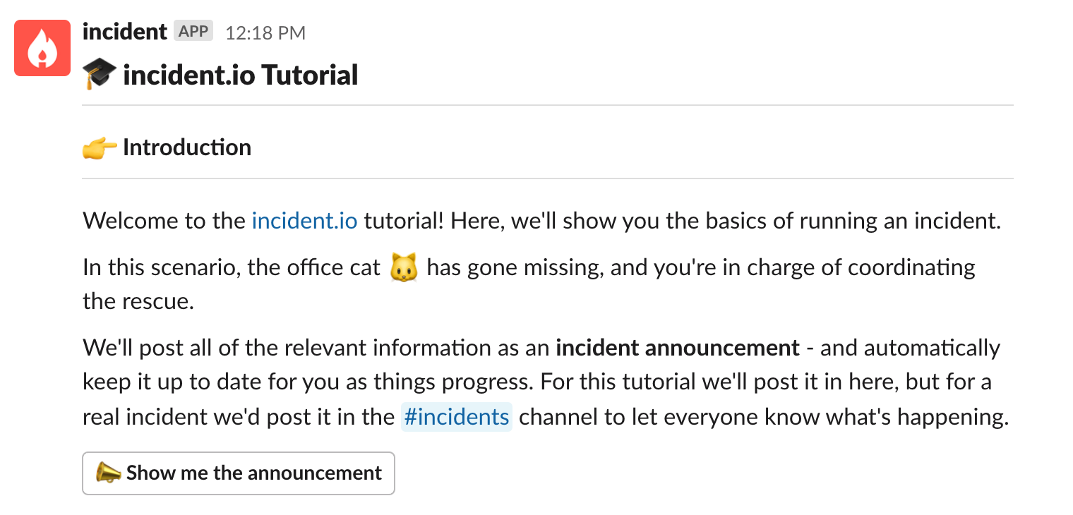
In the incident.io interactive tutorial flow, we guide the user through a simulated incident where a cat is stuck up a tree. We keep it light and engaging, and explain each step clearly.
Say more with less
While good copy is key to great user experience, too much writing can have the opposite effect. Overly long messages and explanatory text clutter up the user interface, taking up valuable screen real estate and distracting the user from what’s actually important on the screen.
When writing or reviewing copy for incident.io, I go over it several times to remove as much as I can. It’s amazing how often we repeat ourselves or pad out sentences without thinking.
Get someone who hasn’t been involved in building the feature to try and use it. What’s the smallest amount of instruction you can give them so they know what they need to do? Have you used any engineering-specific jargon that your users won’t be familiar with?
Consider: Does this copy add anything to the context it’s displayed in? Can you say the same thing using fewer words?
In the words of Kevin from The Office, “why waste time say lot word when few word do trick?”.

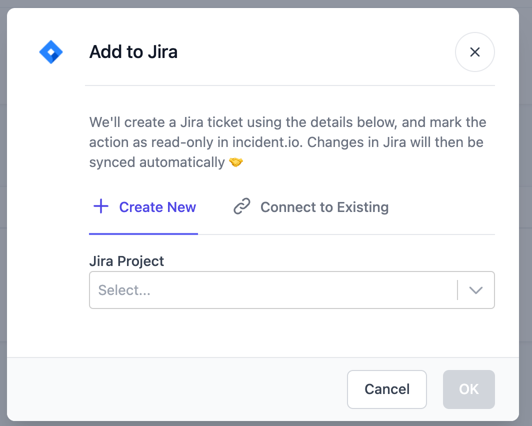
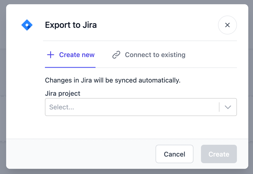
An example of where we trimmed something down recently was the “Export to Jira/Linear/GitHub” dialog:

As a user I already know that this is going to create a new issue in Jira - the tab says so, and I clicked the button because I wanted to export the action to Jira. We don’t need to say it again.
The emoji doesn’t add anything, either. We tend not to use emoji quite so much on the web dashboard as they take up space - they are more contextually appropriate in Slack, where emoji are everywhere already.

The only bit of the explanatory text we kept was the information that changes would be synced automatically.
We also made sure everything was sentence case for consistency, and changed the text on the submit button to reflect what was actually happening.
“OK” is better suited to a confirmation dialog. We chose “Create” here as we’re creating a brand new issue, and the verb matches up with the highlighted “Create new” tab in the dialog. If you were to select “Connect to existing”, the button text changes to “Connect”.
Write clearer, right now
Good, clear writing takes practice, but the good news is it becomes second nature the more you do it. There are a few things you can start doing now:
- Keep your writing concise and remove redundant words and sentences
- Choose simpler words over more formal or complicated ones
- Get someone else to proof-read your copy to make sure that it makes sense and conveys its meaning as clearly as possible.
Spotted some weird words in incident.io?
We’re tidying copy as we go, but there are still parts of the product we haven’t tackled yet. The incident.io Community is a great place to feed back about copy in the product, and let us know about any areas for improvement.

See related articles

How it feels to run an incident with AI SRE
For the last 18 months, we've been building AI SRE, and one of the things we've learned is that UX matters more than you think. This week, I used AI SRE to run a real incident, and I walk you through it end-to-end.
 Chris Evans
What does using AI for post-mortems actually mean?
Everyone is using AI to help with post-mortems now. We've built AI into our own post-mortem experience, pulling your Slack thread, timeline, PRs, and custom fields together and giving your team a meaningful starting point in seconds. But "AI for post-mortems" can mean very different things.
 incident.io
Why post-mortem action items die
You can run the best debrief of your life. Honest timeline, blameless tone, real insights. People leave the room nodding. And then nothing happens. Here's how to fix that.
 incident.io
So good, you’ll break things on purpose
Ready for modern incident management? Book a call with one of our experts today.

We’d love to talk to you about
- All-in-one incident management
- Our unmatched speed of deployment
- Why we’re loved by users and easily adopted
- How we work for the whole organization


