Dashboards aren’t (quite) dead
July 29, 2026 — 11 min read
It used to be the case that most data questions would’ve been answered either by pre-built dashboards or by asking the Data team.
Self-serve analytics tools went one step further: safe, governed datasets built by Data teams let anyone dig into the numbers without having to worry about how table joins worked, how metrics like “revenue” were defined, and so on.
But now with an LLM, data access, and a few simple prompts, anyone can answer their own data questions with (near) endless flexibility & customisation of what the output looks like.
To do this well (i.e. make sure the answers are correct), Data teams have focused on providing reliable interfaces between LLMs and data. Typically, this has been achieved through a mix of custom tooling & exposing self-serve analytics tools via their own native LLM interfaces.
All of this leads to a fairly obvious question: if any business user can (reliably) answer any question they want, on demand, with bespoke outputs, and even combine it with qualitative information like deal notes / Slack messages / Notion docs etc., why bother having dashboards at all?
I believe it comes down to 2 things:
- Having a consistent way of viewing your data.
- Dashboards being useful inputs to LLM workflows, not just read-only outputs.
LLMs can give you inconsistent (but correct) results
There’s a lot of material out there on how to get an LLM to answer data questions correctly, but it mainly boils down to business context.
Point an LLM at your data warehouse, without any guidance, and ask it “what was our deal win rate last month?” and you’ll likely watch it mull over things like deal stages, what types of deal to include, and make a best guess at what it thinks is the most “correct” answer.
This isn’t a new problem, nor an unsolved one: table & column descriptions combined with a well-constructed semantic layer (table joins, primary keys, metric definitions) go a long way towards both humans & LLMs answering data questions consistently & correctly.
But this doesn’t change the fact that even with the same guidance, pulling the same metrics (correctly), you can end up with different stories from the same data. Semantic layers make sure everyone calculates win rate the same way, but they don’t decide which cut of win rate the business actually looks at each month.
Let’s extend the win rate example:
- CEO: pulls win rates, monthly, across all types of deals.
- Sales leader: pulls win rates, weekly, split by new vs. existing business.
- Marketing leader: pulls win rates, weekly, for marketing-sourced new business.
All 3 approaches are valid, and all calculate win rates the same way. Yet, if you asked each of them “what have our win rates been over the past month?” you would likely end up with 3 different answers.
LLMs can remove the friction from getting correct answers from your data, but you risk shifting this friction downstream to (in this case) 3 leaders in a room trying to reconcile why their numbers don't line up.
Dashboards help provide consistency that LLMs can lack
A common pattern to solve for consistency is to provide LLMs with example queries: if a user asks X then you probably want to run query Y.
Dashboards are just an extension of this: a “deal review” dashboard that contains a visual of win rates over time cut by N-dimensions is essentially just a saved SQL query, run & reviewed periodically, that the CEO / Sales / Marketing have agreed is useful to run the business with. That agreement is the part an LLM can't (and shouldn’t) reproduce, and the reason dashboards still add value.
You can then also think of dashboards more broadly as the top level of curation of data.
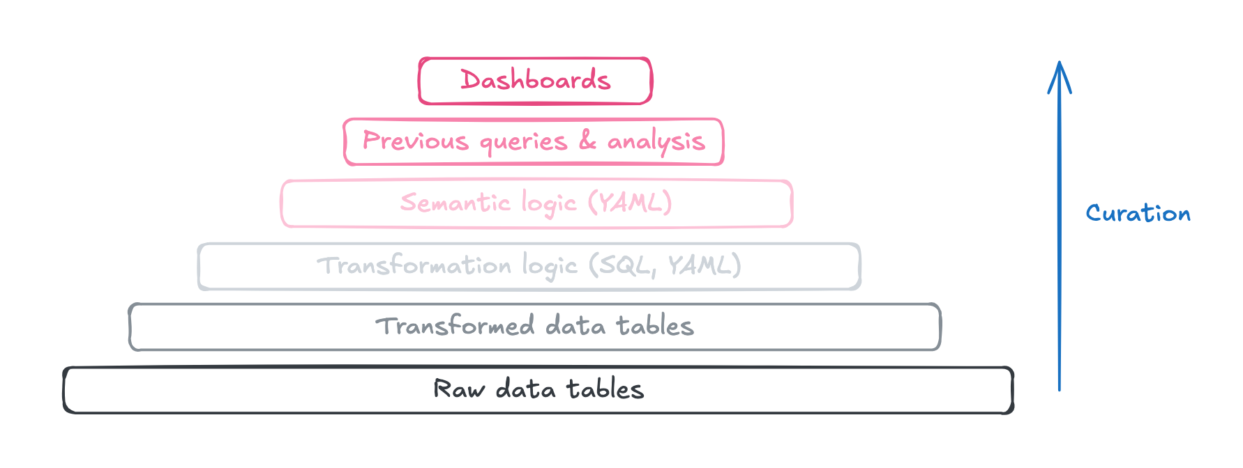
More “curated” here means a stronger signal (both to a human and an LLM) on how to analyse data if you were asked a question with no prior business context (e.g. deal win rates):
- Dashboards: How do we currently analyse this type of data? Which is the main one leadership use to look at this on a regular basis?
- Previous queries & analysis: How have we previously analysed this type of data?
- Semantic logic: If I’m running an analysis from scratch, how should I analyse this type of data?
- Transformation logic & below (SQL, column descriptions, rows of data etc.): If I haven’t got any information on how to analyse this type of data, what do I think would be the most sensible way of doing so?
Dashboards are still useful as a consistent (and visually represented) set of curated queries, that both humans and LLMs (more on that later) can use as the starting point for “here’s how we actually analyse a particular set of metrics”.
But watch out for clutter
The blocker, historically, with dashboards was the time taken for the Data team to build them. This is no longer true with modern analytics tools, as LLM-based workflows have drastically reduced the effort to build & maintain dashboards. But this is a double-edged sword.
If it's trivial to spin up ten near-identical "win rate" dashboards, and neither a human nor an LLM can tell which is the source of truth, then the consistency problem highlighted earlier just resurfaces in a different form.
Curation, once again, is key. Make it clear which dashboards are the authoritative ones (label with “Data team approved”, organise key dashboards into top level folders).
- Keeping dashboards well curated is a really hard problem to solve, and has been long before LLMs!
Another thing worth bearing in mind is that not everything needs to be a dashboard.
- There will always be ambiguous cases that sit between a one-off analysis and something like a polished key metrics dashboard, such as tracking a set of success metrics to monitor a new product launch.
- A useful framing is to ask yourself “If this was broken in ~1-2 months’ time, would it be worth fixing?”. If not, it’s worth having a route to avoid storing these types of analyses alongside higher-polish dashboards.
- These can still live in your BI tool, and even in the format of a dashboard, this is more an exercise to make it easy for a human (or an LLM) to know which dashboards are the ones to go to by default.
Dashboards can be powerful LLM inputs
Whilst dashboards offer consistency, they aren’t without their drawbacks:
- It’s increasingly common for both technical & non-technical users to run the bulk of their day-to-day out of LLMs, and they generally don’t want to switch between interfaces.
- They’re often inflexible for end users, and it’s typically not easy to dive into the why behind a trend in the data.
- They often lack qualitative data sources that make analysis with LLMs so powerful.
The last point is particularly important, and we can illustrate this with an example!
Below is an example schedule health factor metric for a customer over time that exists in our customer health dashboard. It’s a calculated metric between 0-100% based on how well we think a customer is using the scheduling part of our On-call product, which feeds into our overall customer health score.
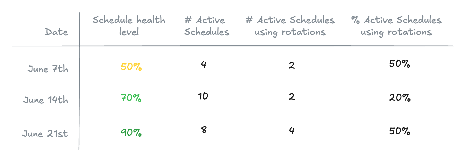
As context:
- Rotations are a way to have multiple rotas on the same schedule (e.g. UK support, US support) without needing to maintain separate schedules.
- This isn’t the full picture - we’ve only included one variable out of several that go into the schedule health metric.
The example customer above appears to have expanded the number of schedules in use from 4 → 10, but then cut down 2 of these and added rotations to 2 more of their schedules, which has improved their schedule health level.
Imagine as a Customer Success Manager that you’d want to know why the customer is now using rotations more extensively in our product:
- You could always speak with the customer directly - but this doesn’t scale, and will inevitably be slower to get to an answer than diving into the data.
- You could also build tables / visuals into a dashboard for every possible follow-up question - in this example a table of the individual schedules - but this quickly becomes cluttered, and not all information renders nicely in dashboard form (e.g. JSON config).
- You could also drill into the rows of data behind each datapoint, but this is still a manual process that you need to repeat for every follow-up question you want to ask.
If we want to dive deeper into a trend on a dashboard, why not treat the dashboard itself as a source of information for an LLM in the same way you would Slack / Notion etc.? This unlocks more powerful workflows:
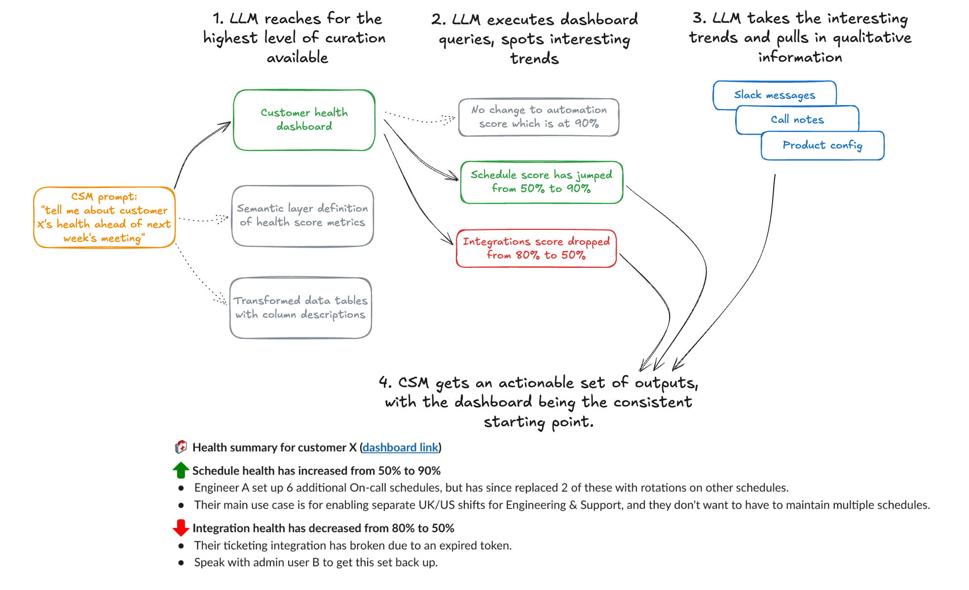
Using LLMs to combine qualitative & quantitative data isn’t new - but it’s a great way to leverage the consistency that a dashboard provides combined with the flexibility to dig 2-3 layers deeper on demand, and only dive into the areas worth exploring further.
Closing thoughts
Dashboards aren’t (quite) dead - but they’ve changed in purpose. They matter less as the sole place people go to look at charts, and more as the curated, trusted layer that keeps both humans and LLMs telling the same story from the same data.
- There will always be a need for a consistent set of metrics, shown a certain way, for decision-making stakeholders to use on a regular basis. Dashboards still fit this purpose really well.
- Dashboards can be thought of as the top level of curation for an LLM, and a useful starting point - essentially a set of queries that demonstrate how you actually analyse a set of metrics.
- The interface people use to consume dashboards is less important. It should be flexible, and you should meet your users where they work.
- LLMs have made dashboards far cheaper to build and maintain, but they only deliver consistency, or work well as LLM inputs, if it stays obvious which ones are authoritative.
Build fewer, name them well, and treat the best ones as first-class context for your LLMs.

Jack Colsey
Head of Data
See related articles

Institutional knowledge doesn't scale: Building an agentic data analyst
Institutional knowledge was always the bottleneck. Here's how we built an agentic data analyst to distribute it more efficiently — and what happened when we let the whole company ask it questions.

August 3, 2026

Pager fatigue: Making the invisible work visible
We developed The Fatigue Score to make sure our On-call responders’ efforts are visible. Here's how we did it, and how you can too.

April 25, 2025
Going beyond MTTx and measuring “good” incident management
What does "good" incident management look like? MTTx metrics track speed, but speed alone doesn’t mean success. So, we decided to analyze 100,000+ incident from companies of all sizes to identify a set of new benchmarks for every stage of the incident lifecycle.

March 25, 2025
So good, you’ll break things on purpose
Ready for modern incident management? Book a call with one of our experts today.
We’d love to talk to you about
- All-in-one incident management
- Our unmatched speed of deployment
- Why we’re loved by users and easily adopted
- How we work for the whole organization