Building On-call: Our observability strategy
August 22, 2024 — 21 min read

At incident.io, we run an on-call product. Our customers need to be sure that when their systems go wrong, we’ll tell them about it—high availability is a core requirement for us. To achieve the level of reliability that’s essential to our customers, excellent observability (o11y) is one of the most important tools in our belt.
When done right, observability enhances your product experience from two angles:
1. Proactive: Having constant awareness of the health of your system and what “normal” looks like means you can spot when it’s starting to creak before it completely falls apart. This allows you to see problems before your customers do.
2. Reactive: Unexpected incidents will always occur, you can’t fully protect against this. What matters in these situations is having invested in an o11y set-up that allows engineers to immediately understand exactly what is broken and how. Being able to do this hugely impacts the severity and scale of your incidents.
The difference between excellent and average observability can be subtle. You might have extensive data about your systems, but it doesn’t matter if your team doesn’t reach for it or find it easy to use. Without discipline around observability, you’ll end up with "dashboard soup"—lots of single-use dashboards created for a single purpose that are impossible to find when you need them.
The importance of good UX in your o11y setup cannot be overstated.
You can't achieve this by simply choosing nice tooling and expecting everything to fall into place. Great UX requires active investment in understanding your systems, the data they generate, and how engineers need to use it.
It’s just not good enough to have a few infra-leaning engineers who understand how to use dashboards and logs and rely on them when needed. Bringing a user-focused lens to your internal set-up and treating it like a product can hugely change the adoption and barrier to entry of this information, and make it an engineering team-wide responsibility.
In this post I’ll outline how we set up our o11y to achieve this, using our on-call system as an example of how that works in practice.
What does our system look like?
Throughout this post, I’ll use our on-call system as an example, so here’s a quick rundown of what it’s responsible for.
- Receiving alerts from 3rd party tools (like Datadog or Sentry)
- Working out who to page by looking up attributes on the incoming alert (like team or service) and mapping them to escalation paths
- Notifying people by sending a notification to their phone or other contact methods
So at its core, it follows a principle of “alerts in, notifications out”. As a system, it looks something like this:
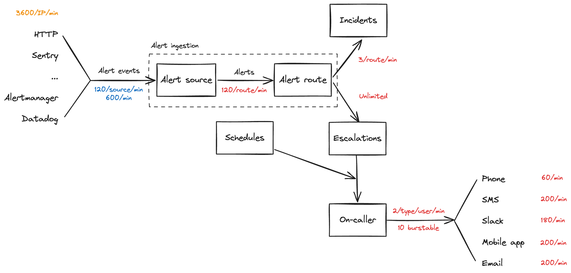
Your team must have a clear picture of your system, just like this.
Map it out together, and use this as a shared understanding of what your observability is illustrating. Try to mentally split your system into separate sub-systems, each with one clear job. The boundaries won’t always be clear here depending on your system design, but having separation of concerns is important for building clear dashboards.
Great observability relies on structure
We began by stressing the importance of putting usability at the heart of your observability stack. What does it actually mean to get this right?
Great observability gives a consistent picture of your system at all levels: from a bird’s-eye view, all the way down to individual requests.
When you first receive an alert that says something is wrong, you have no idea what’s actually broken. If you’re receiving many alerts at once, there’s so much noise that it can be hard to know what’s happening—are they isolated to a specific problem or is the entire system failing?
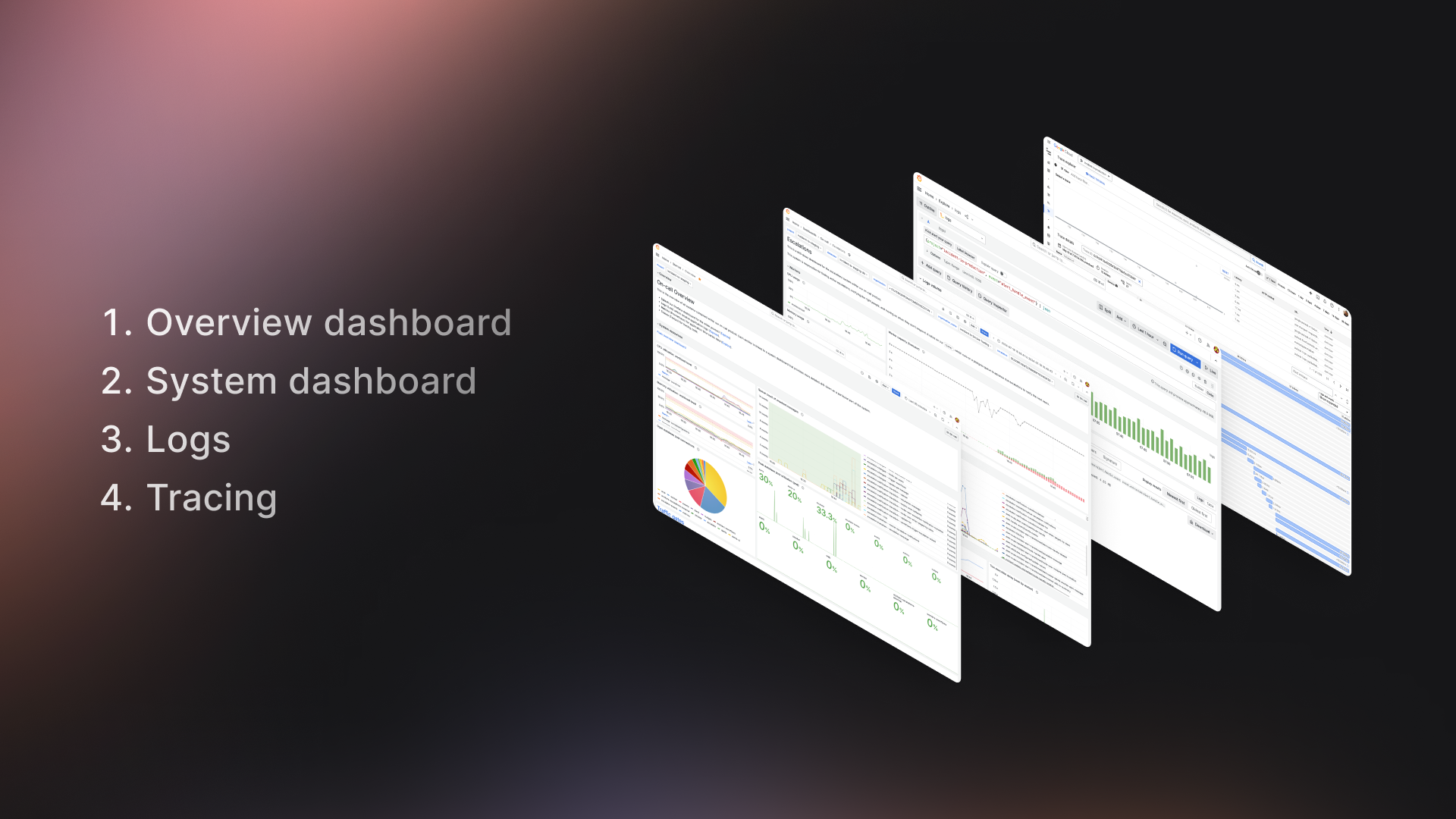
We build our dashboards so you can jump straight into a high-level overview to find out which part of the system going wrong, before drilling down into system-specific dashboards, the source logs, and then finally a detailed trace for each log.
Those pieces fit together something like this:
These dashboards are built intentionally, aiming to meet a few key goals:
- Easy to understand at a glance: We want to optimize for an engineer to understand whether a system is relevant to the problem they’re investigating with just a glance. With such a wealth of information available, it’s crucial to make sure your dashboards have a clear focus and easily direct engineers to where they need to go next.
- Consistent: It’s unrealistic to expect engineers to have used all dashboards before they need them during an incident. The structure of each dashboard should be consistent and simple, so if you’re comfortable with one, you can transplant that context to all other dashboards you use, and be comfortable jumping into unknown territory. Having a solid design system for your dashboards means when your team gets involved and creates their own, they’ll easily fit into your existing flows.
- Make moving between dashboards and logs easy: When debugging a new issue, it feels intuitive to jump from a high-level “what part of my system is broken” down to individual requests, and vice-versa. An engineer shouldn’t have to have many bookmarks, each with different queries to investigate the same problem across different surfaces (metrics, logs, traces).
Here’s a gif of how those flows all fit together:
One way to meet these goals is to create a design system for your dashboards, by setting a consistent structure. For us, that looks like starting with a standard "overview" dashboard for each system and drilling down to service-specific dashboards that share common patterns. Let’s take a look at each of our example dashboards to see what that feels like.
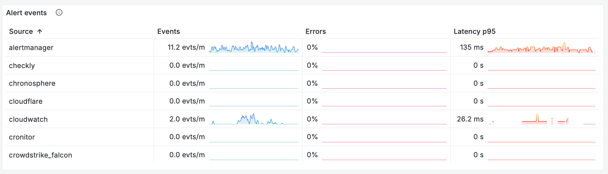
Overview dashboard — Which part of my system is unhappy?
An overview dashboard should be every engineer’s first stop when they first realize something is wrong. Think of it as a traffic light for each subsystem that makes up your product, signals that can be understood at a glance. This dashboard won’t give you the full details of what’s going wrong but should act as a signpost to quickly point you toward the next step.
Push this dashboard everywhere - we have it as our Grafana homepage and bookmark it in Slack channels. If you can train your team to use the dashboard even when you’re not in an incident, you’ll be much more comfortable when things go wrong.
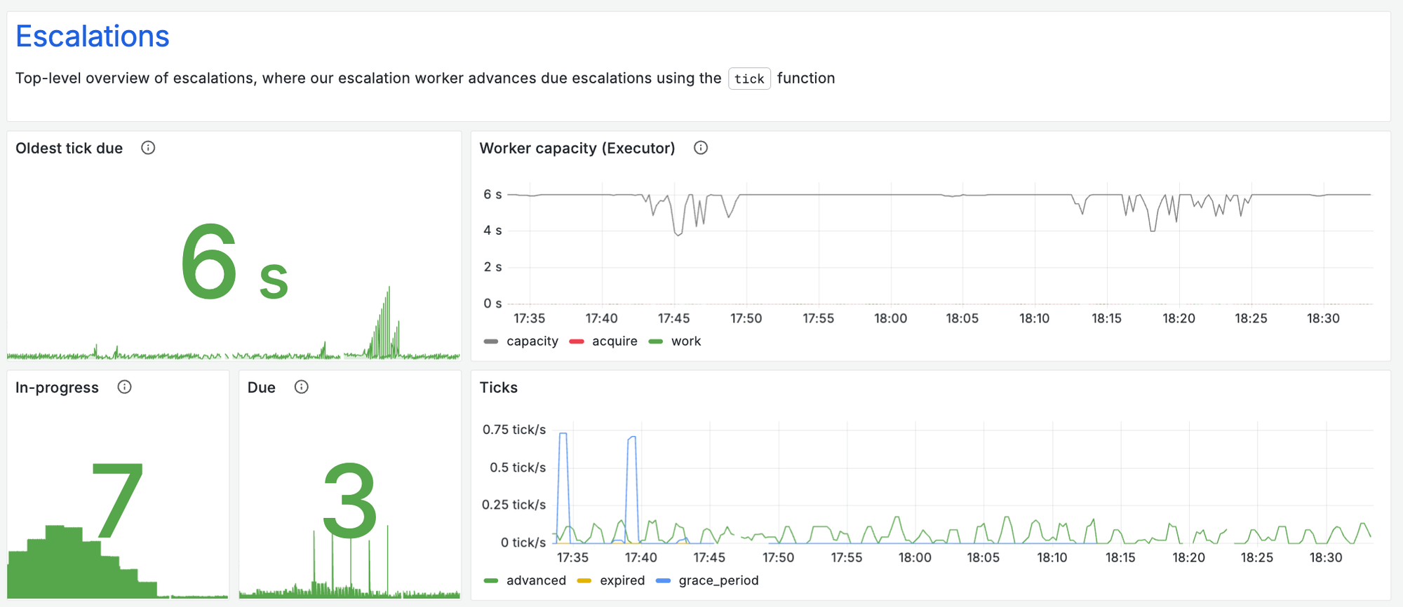
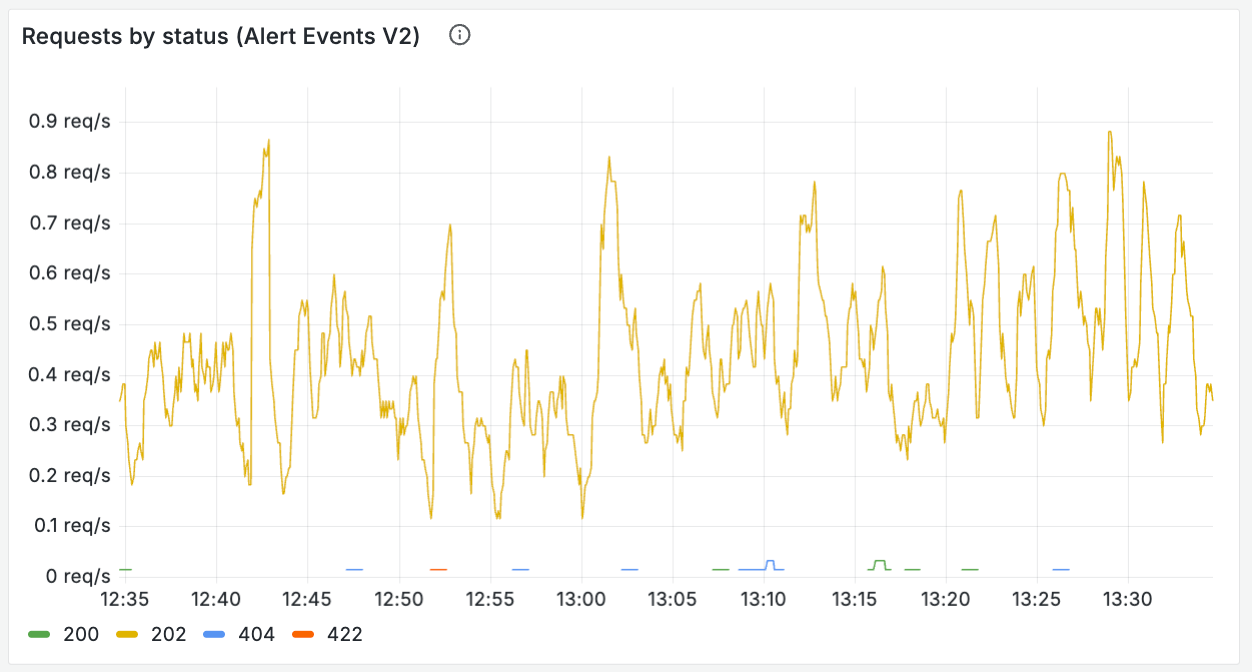
This is our overview dashboard, during a recent load test.
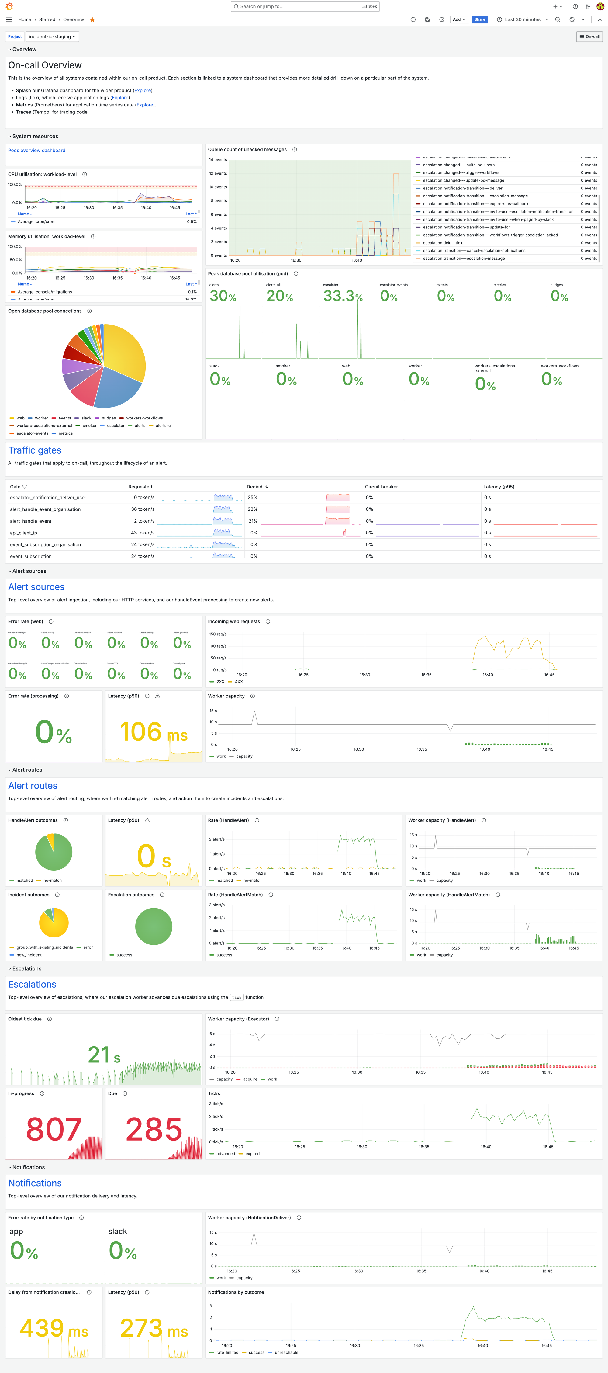
With just a quick glance, it’s super easy to see that it’s our escalations system that’s seeing a lot of load. That gives us all the information we need to jump straight into our escalations system dashboard and look in more detail.
What does it show?
As we’ve discussed, overview dashboards are an efficient traffic light for each of the constituent parts of your system.
This signal should go red if anything is wrong—no matter how minor. You should actively avoid false negatives (your dashboard looks green when something is up). Any abnormal behavior should be immediately obvious.
Examples of efficient high-level overviews we include on this dashboard:
Infrastructure health
How is the infra underpinning this system functioning? Show high-level metrics that represent the health of those dependencies. As an example, we run our app in GKE Autopilot across several k8s deployments, and everything depends on a CloudSQL Postgres, so we track:
- CPU and memory for each K8 deployment
- Database CPU utilization
Queue health
Is the async work that powers your system being processed successfully, without delays? We track:
- The time spent running jobs for each of our subscriptions - this is the most important metric for our async work. It tells us exactly how many concurrent events we were processing at any one time, and how much load we were under - if any subscriptions are struggling this chart will make it obvious.
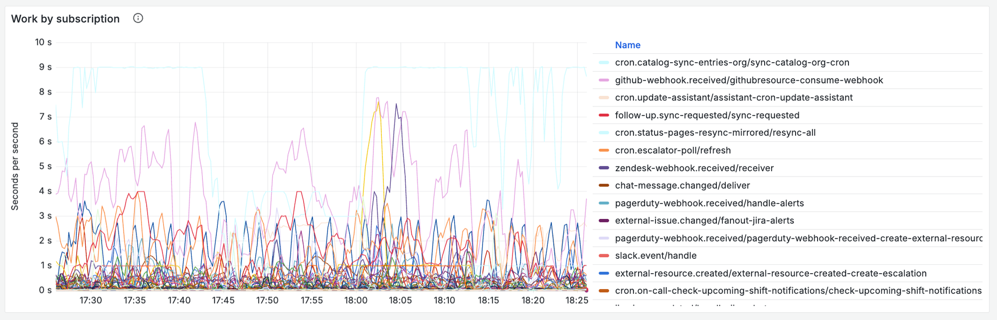
- Number of messages currently in the queue, and the age of the oldest un-acked message for each of the relevant PubSub subscriptions to our system. This allows us to quickly eyeball whether any processes are struggling, and how bad the delays to users are.
Simple health overview for each subsystem
For each constituent subsystem, you should have a clear picture of whether it’s happy or sad. Each of your subsystems should have one job - you just need to understand whether it’s doing that job well. Work out what questions you can ask to quickly define a system’s health, and track them. Determine thresholds on those metrics for what feels “unhealthy”. Crossing any of these should immediately make your dashboard feel red and scary.
Some examples of what we track:
- Response codes for any public-facing APIs
- Latency of key processes
- The outcome of key processes
Each of these breakdowns on your overview should directly link out to the associated system dashboard, so once someone identifies something as problematic, they are only a click away from further investigation.
System dashboard — What specifically is going wrong?
This dashboard should give an exhaustive picture of the health of a particular subsystem. The right level of abstraction for a system dashboard is something with a single job to do.
For us, our system dashboards split our system into four key areas, each aimed at answering a particular question:
- Alerts: are we ingesting and creating alerts in our system?
- Alert routing: are we processing those alerts and creating incidents and escalations from them?
- Escalations: are we finding the right people to notify at the right times?
- Notifications: are we notifying those people effectively?
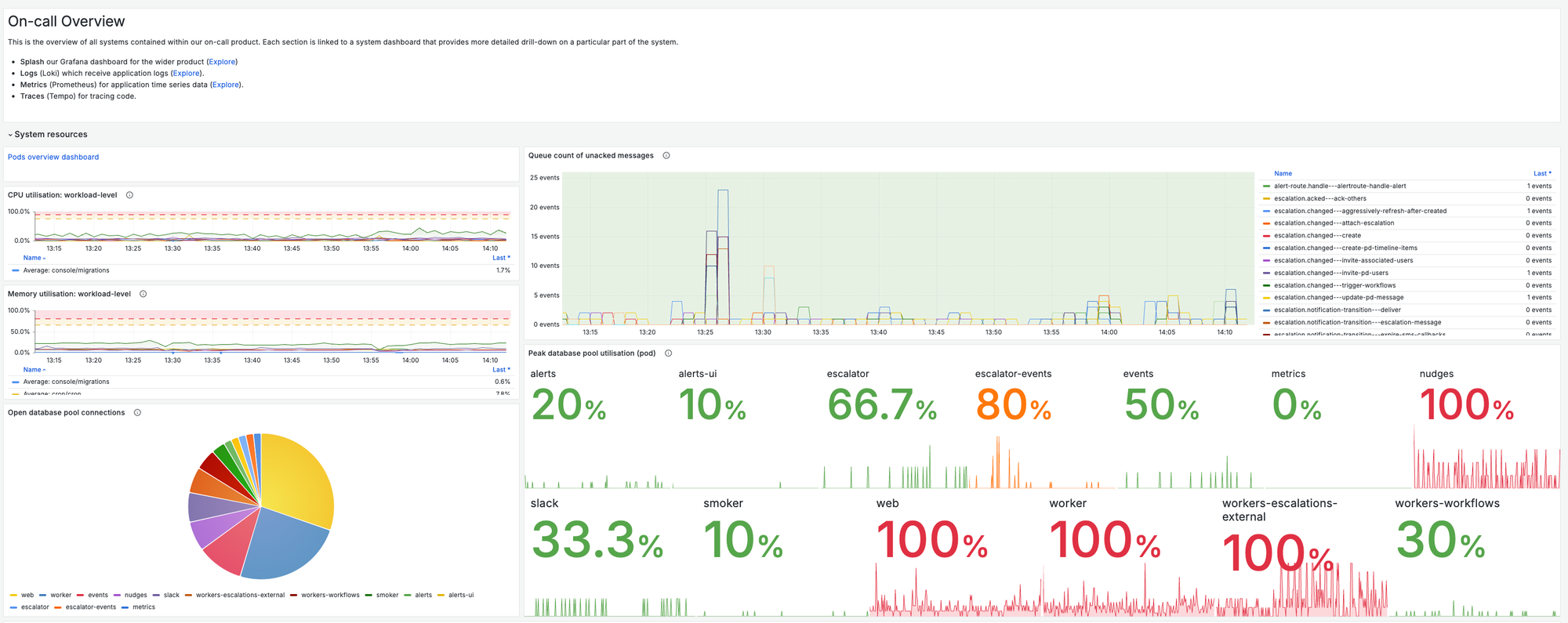
This is our own escalations system dashboard for our earlier load test. Taking a look at it we can quickly understand more detail about the unexpected load that had been highlighted in our overview dashboard.
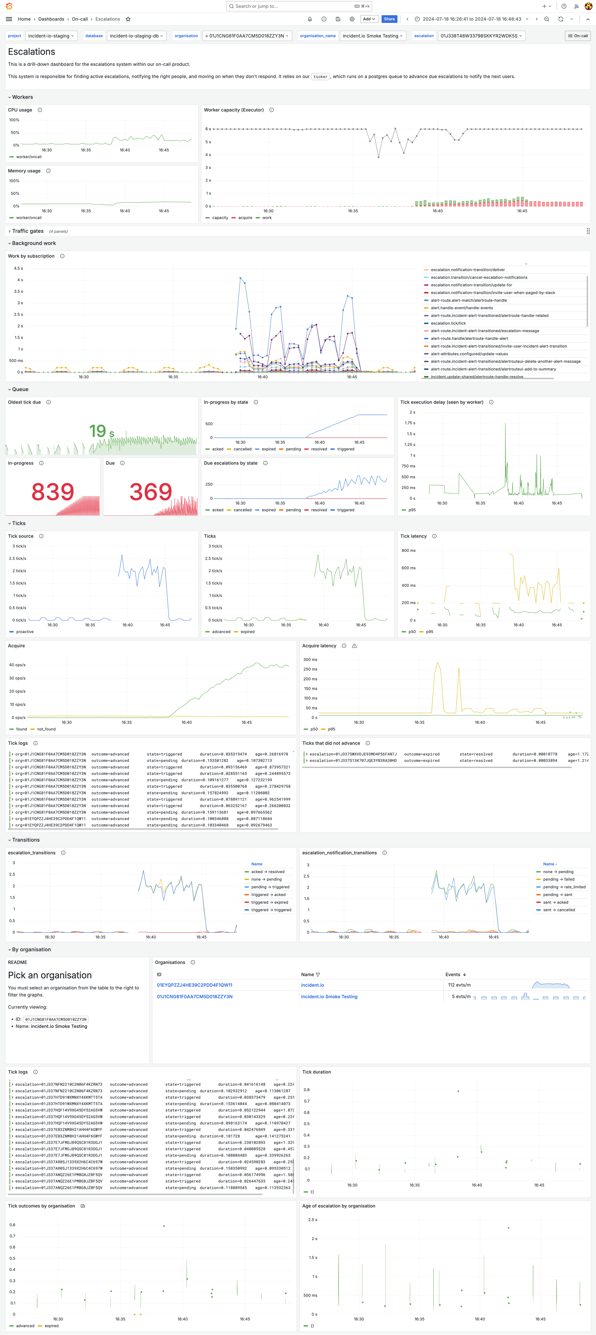
While we’re under a very high load, we know that the time between someone being escalated to, and receiving a notification is still pretty comfortably under 1s on average—we don’t need to worry immediately.
We can see exactly which organization is producing this volume, filter our logs to see examples, and use the log tables in our dashboard to dig further into the specific requests.
What does it show?
The system in question has a single job—you should track everything that could go wrong with this and plot it against time, so you can get a sense of the impact of a problem.
If an engineer is looking at your system dashboard then they already know something is up! The UX and structure should help them deepen this understanding, allowing them to describe how bad the impact is, how customers are affected, and whether it’s currently getting worse.
Questions this dashboard should help you answer include:
Where are incoming requests being rejected?
- Invalid payload rejection from APIs (rate of each 4xx response type)
- Rate limiting and traffic gates—what’s the rate at which you’re hitting the relevant rate limits, and are you denying any requests?
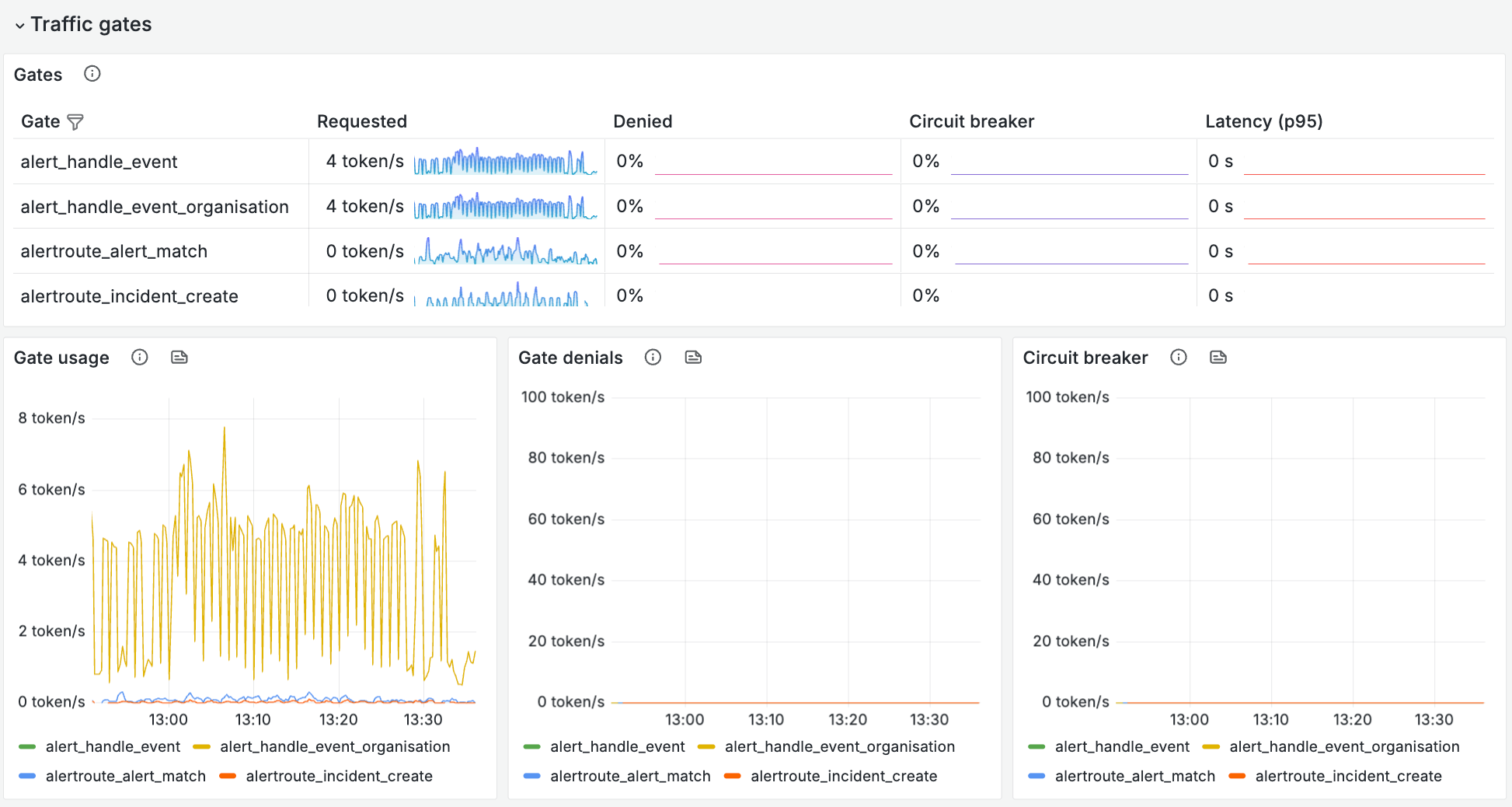
Where are the bottlenecks?
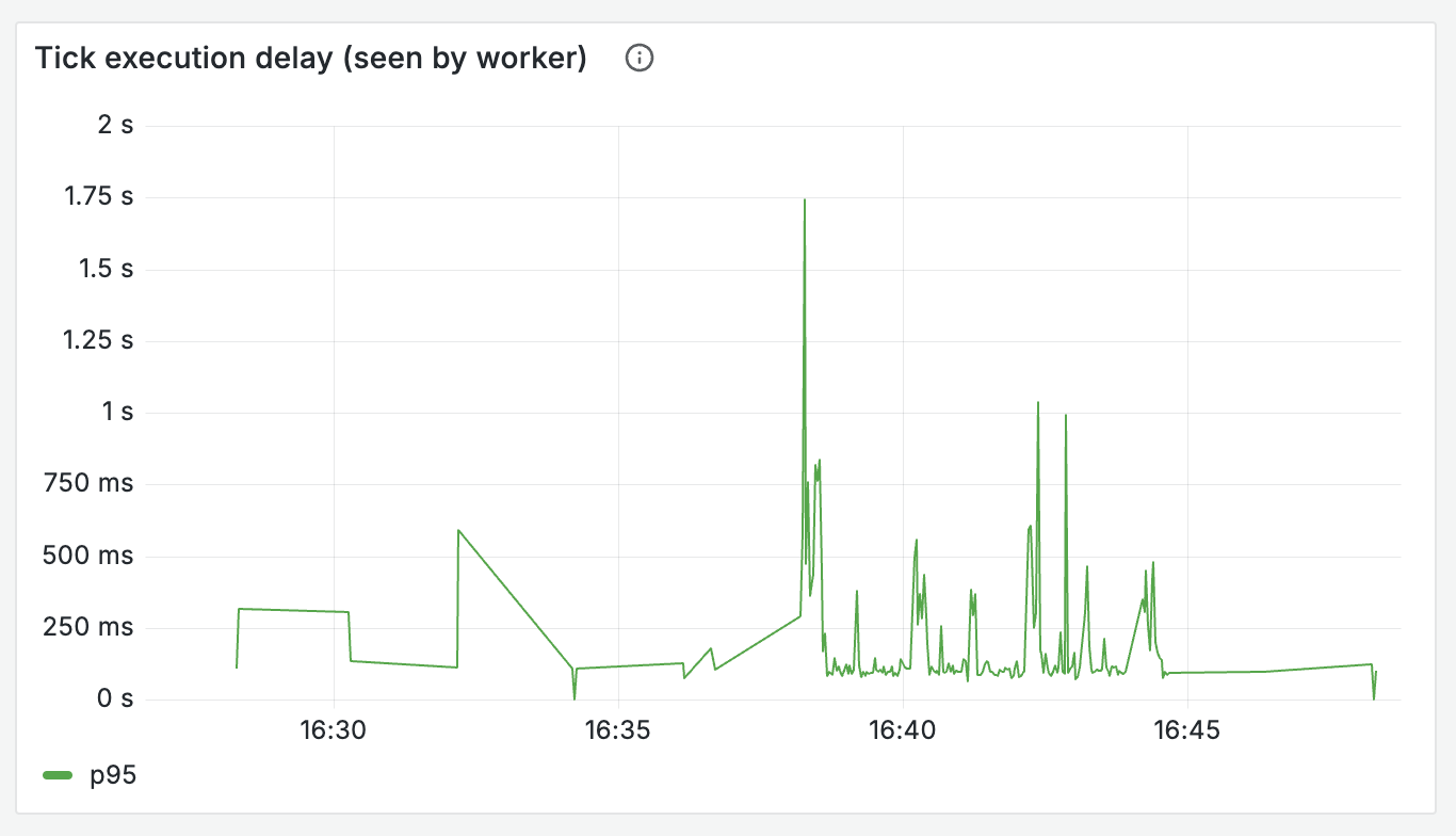
- How healthy are the queues that are necessary to execute this job? Look at both the size of your queue, but also the oldest un-acked messages - is there anything bouncing around that’s failing?
- How slow are the 3rd party interactions you’re making?
- How long do the constituent parts of a request journey take?
What are your outcomes?
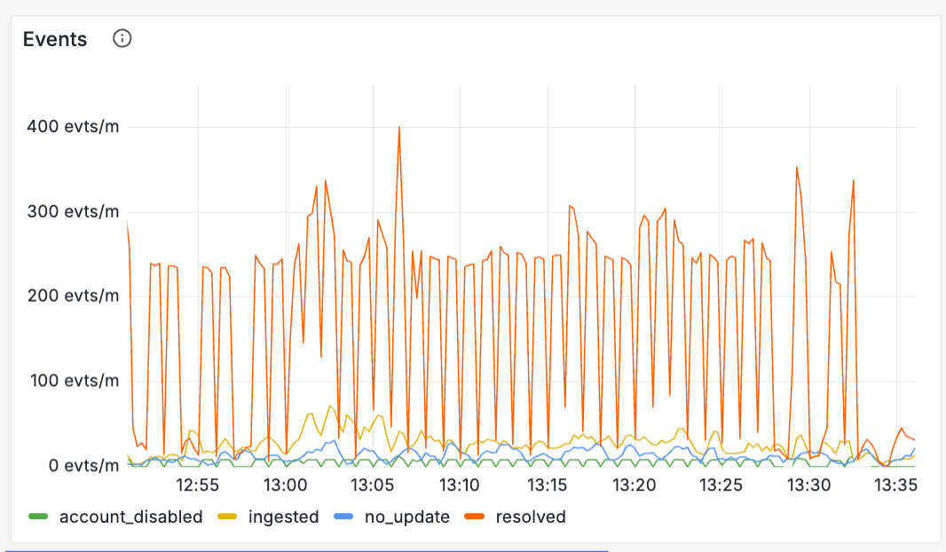
- Track what exactly “success” means - you should be more granular than just pass or fail. Create metrics that understand the output of what the system plans to do next (e.g. rate_limited, no_action, new_incident, error ), along with the relative time each of these takes
How much strain are you under?
- At what rate are you processing requests?
- How much work is the system handling? (the number of seconds of work you’re doing per second) - a good sign of whether you’re being overwhelmed
All of these questions are to be answered over time, so you can understand when things started to go wrong, and how they’ve progressed. It’s also really useful to split your metrics on a field like your outcome - this tells you whether particular request types are taking up more time or work.
For creating incidents from alerts, our outcome field and the corresponding charts look something like this:
HandleAlertMatchIncidentsOutcomeRateLimited
HandleAlertMatchIncidentsOutcomeNewIncident
HandleAlertMatchIncidentsOutcomeNoAction
HandleAlertMatchIncidentsOutcomeGroupWithExistingIncident
HandleAlertMatchIncidentsOutcomeError 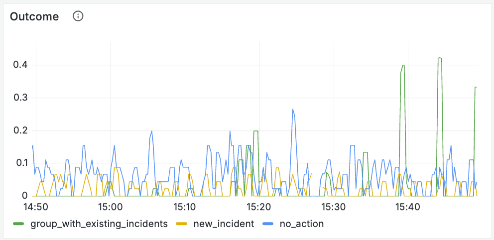
Your system dashboard should hold your hand and lead you directly to your next step down: logs. We include tables of logs split by the labels in your metric to give engineers clear jump off points to drill down further. These are filtered by organization, and we’ve got a handy table that allows you to pick who you’d like to view those logs for.
Logs — What happened to a specific request?
Logs represent drilling down to a single unit of work or request.
Any engineer can write logs, but what we’re aiming for is logs with intuitive UX, and this takes more consideration.
Your logs should clearly show an engineer the journey of a request, detailing what happened and when. They should be consistent across systems—engineers shouldn’t have to remember different queries for each request they care about.
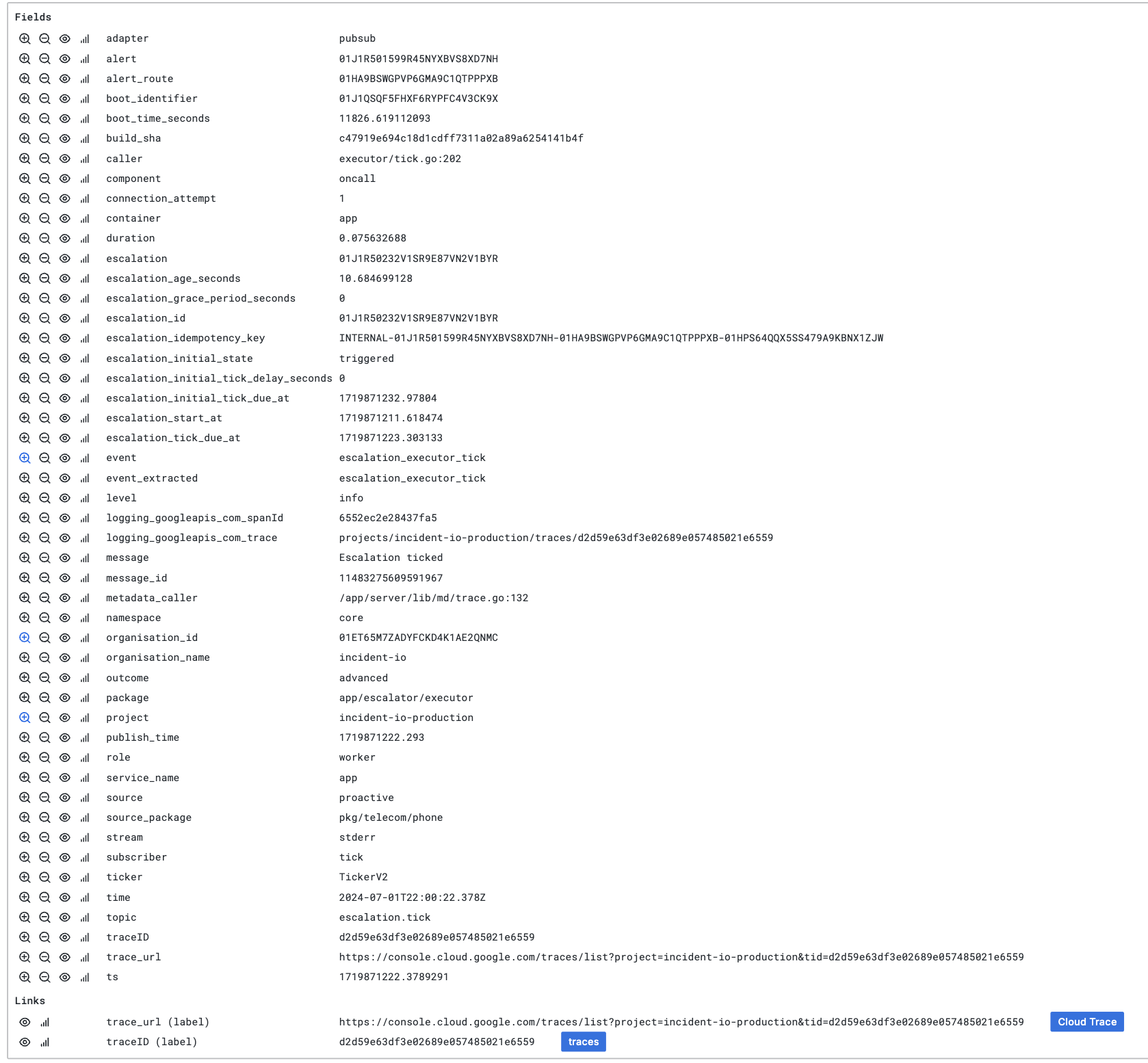
Back to our load test: after seeing that we were experiencing high load, I could efficiently jump into our table of all logs, and grab the ID of the escalation path that was being triggered.
I’m also linked directly to the trace, so I can jump in there to understand exactly what happened here.
So how can you improve the UX of your logs, beyond simply writing better messages?
Event logs
Each of your specific system tasks should have a single core log line. We call this an event log: it is logged every time we execute this task, in the same format, and includes all the important content.
Event logs give an engineer a single, consistently formatted log to begin their search (which tracks the outcome and specific resource IDs to search on), before they dive deeper into the specific journey of a request beyond that.
We log an event after the task is completed, detailing any specific details of outcomes, durations, plus the IDs of resources involved (things we can’t involve in metrics due to cardinality constraints):
log.Info(ctx, "Handled alert", map[string]any{
  // Event
  "event":    "alertroute_handle_alert",
  "duration": time.Since(startAt).Seconds(),
  // Outcome details
  "outcome":     outcome,
  "match_count": matchCount,
  // Alert details
  "alert":               alert.ID,
  "alert_source_config": alert.AlertSourceConfigID,
  "alert_status":        alert.Status,
})
It’s really important that this log always gets logged, no matter the outcome (whether it’s an error, panic, etc.). For this reason we defer our event log until the very end of our execution, so it’s still tracked whatever happens.
You must include (and should expand upon) what’s already tracked in your metrics. Metrics don’t allow you to drill down to a specific unit of work, so it’s important to accompany your counters or histograms with logs which share labels but expand on what exactly happened, allowing you to go from a metric-powered graph into a specific example (the log) of what went wrong.
Event logs (or high cardinality events) are a common pattern in modern observability. You can read more about how this looks in code in a great post by Lisa on Anchor logs.
Exemplars
An exemplar is a specific trace representation of a metric you’re tracking. They’re an incredibly useful tool to bridge the gap from the metric based charts in your dashboard, to actual requests in your logs.
Exemplars allow you to quickly select a request that contributed to your metric value, and jump into the trace with just one click.
Using that in code looks something like this—we track exemplars alongside places where we’re incrementing metrics.

md.ObserveWithExemplar(
  ctx,
  // The metric we're tracking our exemplar against
  handleAlertMatchDurationSeconds.
      // Any labels we'd apply to our standard metric
      With(prometheus.Labels{
          "outcome":             outcome,
          "outcome_incidents":   string(outcomeIncidents),
          "outcome_escalations": outcomeEscalations,
      }),
  // The actual value of the metric we're tracking for this specific request
  // In this case it's duration
  time.Since(startAt).Seconds(),
)
Tracing — What did my request spend its time doing?
Using traces gives us the most zoomed in look at a single request to enable up-close debugging. Digging into a trace allows you to connect the dots between logs and visualize what a request spent its time doing.
Traces are particularly useful for understanding slow requests as they allow you to see where and why your request stalled—whether that be time spent waiting for locks, high latency requests to 3rd parties, or slow queries.
As the lowest level of investigation, there isn’t a great deal we can do here to improve UX, beyond making sure that they are tracking all of the important parts of the request, but there’s a few small tips that can make that more efficient.
Since tracing is the tool you’ll reach for when investigating slow requests, having really specific data about the slow parts of your request makes using them much more effective.
- 3rd party interactions: Engineers should immediately be able to see that a request was slow because you spent 1s waiting on a reply from an external API. We add tracing as standard to any 3rd party API requests, by using a single shared base client across all of our api requests where we apply standard logging and traces.
- Database queries: For all queries, tracking exactly how long they took means you can understand what part of a request is slowing things down. Include the exact query you used in your tracing metadata—this allows you to quickly have a real example of something that was slow. We also track the time spent waiting for a database connection separately to the query itself. This really helps to understand the difference between a query being slow because it’s waiting for a lock or the database is under heavy load, vs. when it’s just trying to find stuff inefficiently!
Exercise it
An observability setup is useless if it’s just theoretically good. You need to know if it works by actually using it and pushing its limits.
An overview dashboard is totally pointless if it doesn’t look broken when your system is failing - you need to exercise it and tweak it to ensure it works when stuff goes wrong.
Game days are one of the most useful tools you have for testing your dashboards actually work, and also getting your team bought into how and why they’d start using these tools.
Consider it like user testing: give them minimal context about exactly what you’ve put in the dashboards, where and why, and notice what’s easy to find, and what they struggle with. It's important to make any necessary changes to your dashboards together with your team—this is the best way to get people comfortable with how they work.
Conclusion
Treating your observability as a product that should feel great will massively level up the way your team interacts with it. Since we’ve taken this approach to our set-up, we’ve found that issues are diagnosed incredibly quickly, and our team feel really comfortable in working out what’s gone wrong and where. When our tooling feels like it's missing something, our clear structure and hierarchy makes it really easy to know where new charts slot in.
Getting here doesn’t happen by chance—it requires deliberate investment in your setup, and buy in from your team on the importance of clean, intuitive dashboards.
This advice should be tooling agnostic. Whilst we run our o11y with Grafana, the core principles of clarity and consistency can apply whatever your stack.

Martha Lambert
Product Engineer
More from Behind-the-scenes building On-call

Behind the scenes: Launching On-call
We like to ship it then shout about it, all the time. Building On-call was different.
 Henry Course
July 9, 2024

Building On-call: The complexity of phone networks
Making a phone call is easy...right? It's time to re-examine the things you thought were true about phone calls and SMS.
 Leo Sjöberg
July 16, 2024

Building On-call: Building a multi-platform on-call mobile app
What does it take to build a greenfield mobile app in 2024? When we launched On-call earlier this year, we had to find out.
 Rory Bain
July 15, 2024
So good, you’ll break things on purpose
Ready for modern incident management? Book a call with one of our experts today.
We’d love to talk to you about
- All-in-one incident management
- Our unmatched speed of deployment
- Why we’re loved by users and easily adopted
- How we work for the whole organization


