UI refresh: New design and enhanced user experience
June 4, 2024

All of the components powering our most used and loved features have been redesigned from the ground up. When you log into incident.io, you can expect a refreshed design that’s more intuitive than ever. We’ve made hundreds of adjustments, but here we’ll highlight some of our favourites.
Refreshed app shell
We’ve given the shell of the app — all the bits around a page — a spruce up. Highlights include a sidebar that makes better use of space and a simplified header for each page.
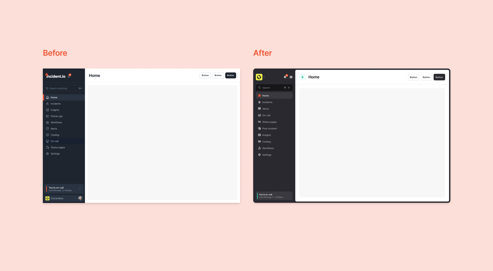
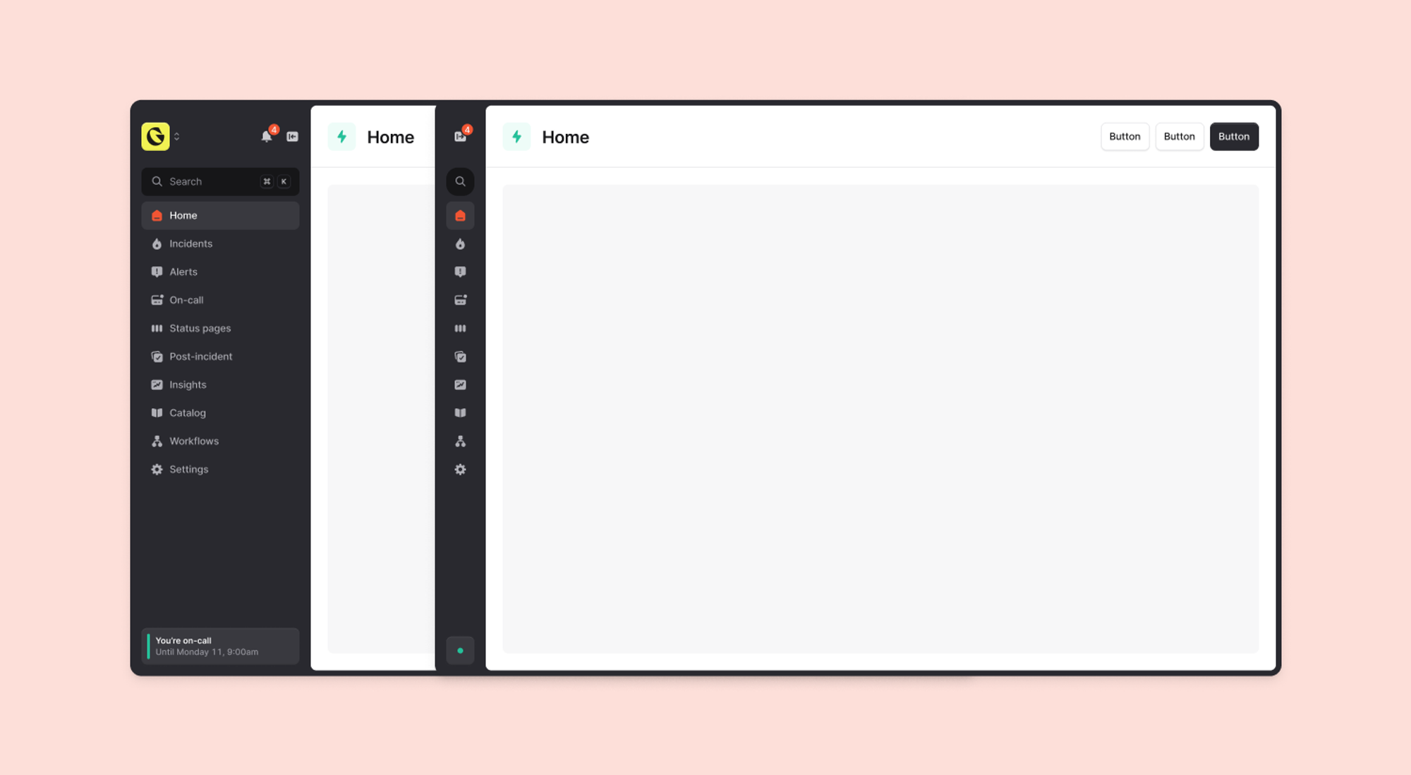
Additionally, if you want even more space, you can now collapse the sidebar.
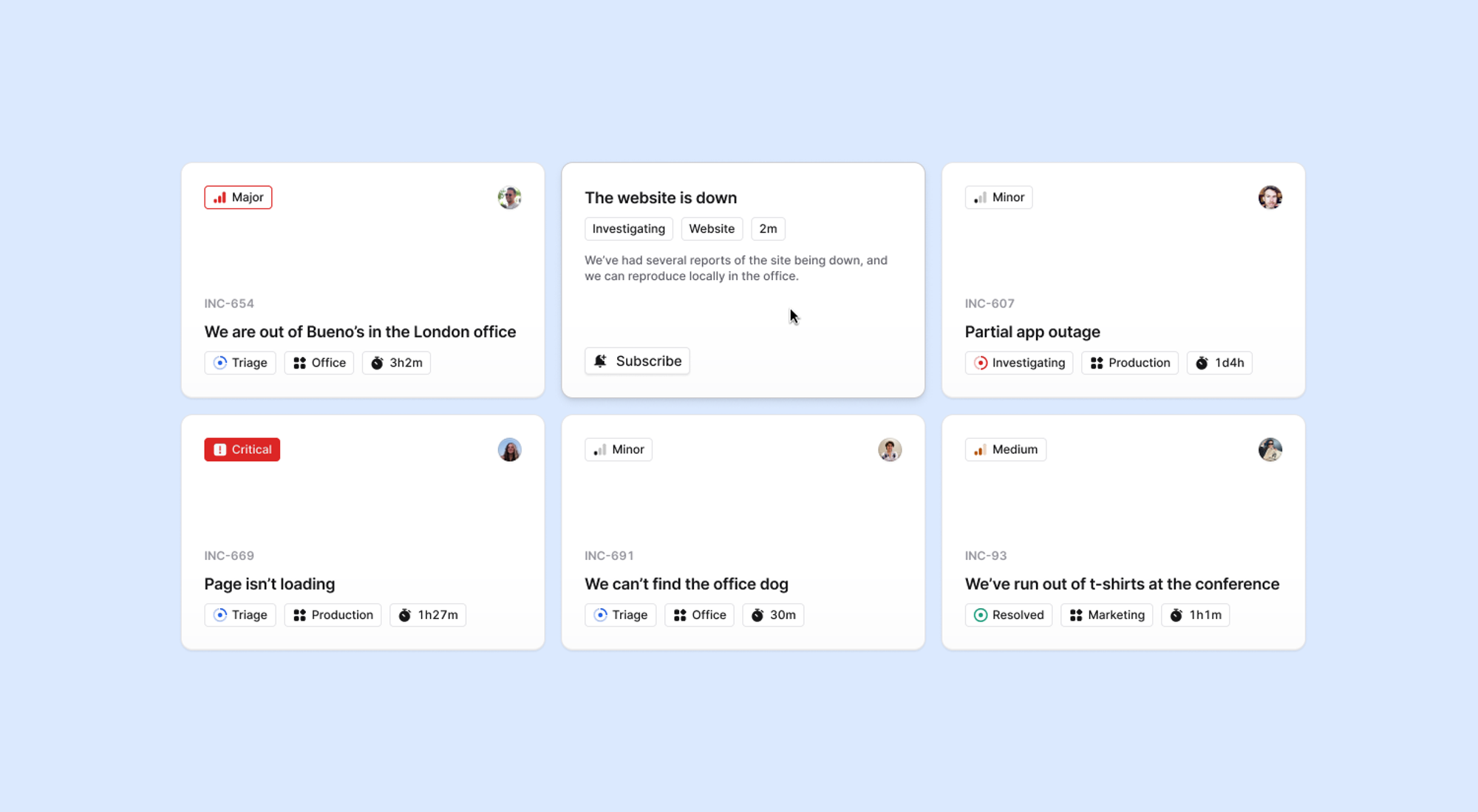
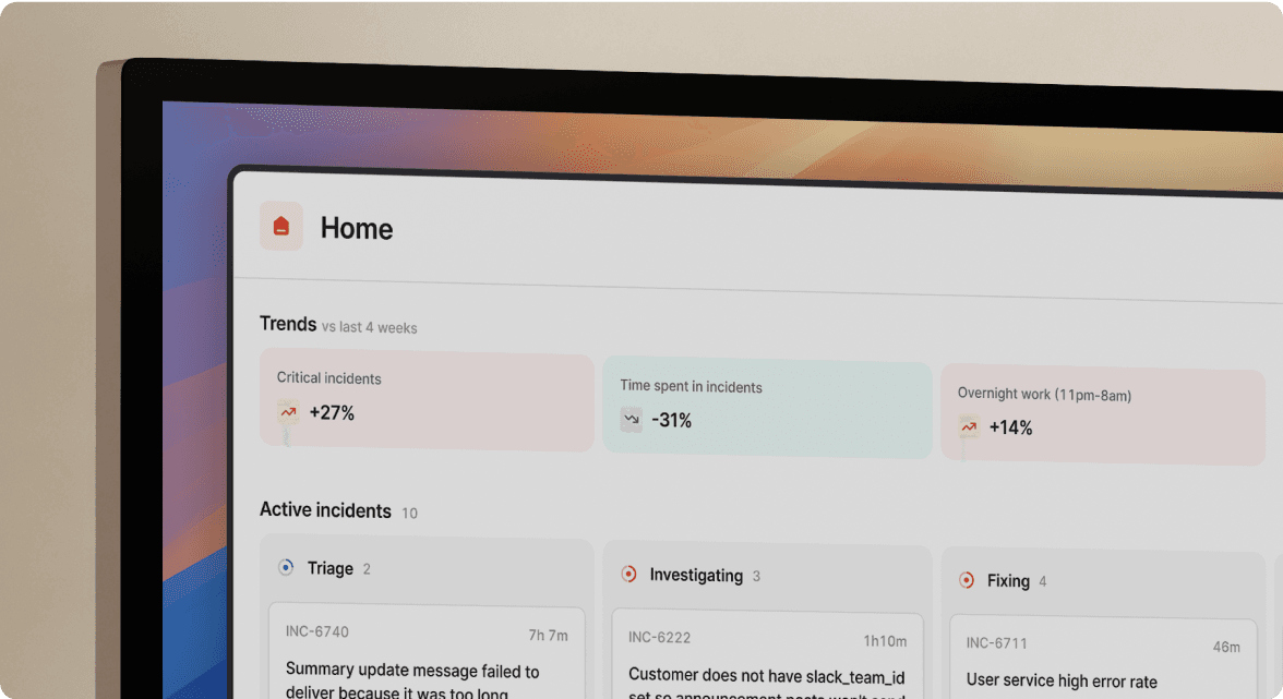
Clearer homepage incident cards
The incident card is one of the most important parts of our web app. It’s where all users, from engineers and customer support to senior leadership, go to understand how incidents are impacting their business right now. We’ve made them easier to scan in the heat of the moment so you can find what you need to know in seconds.
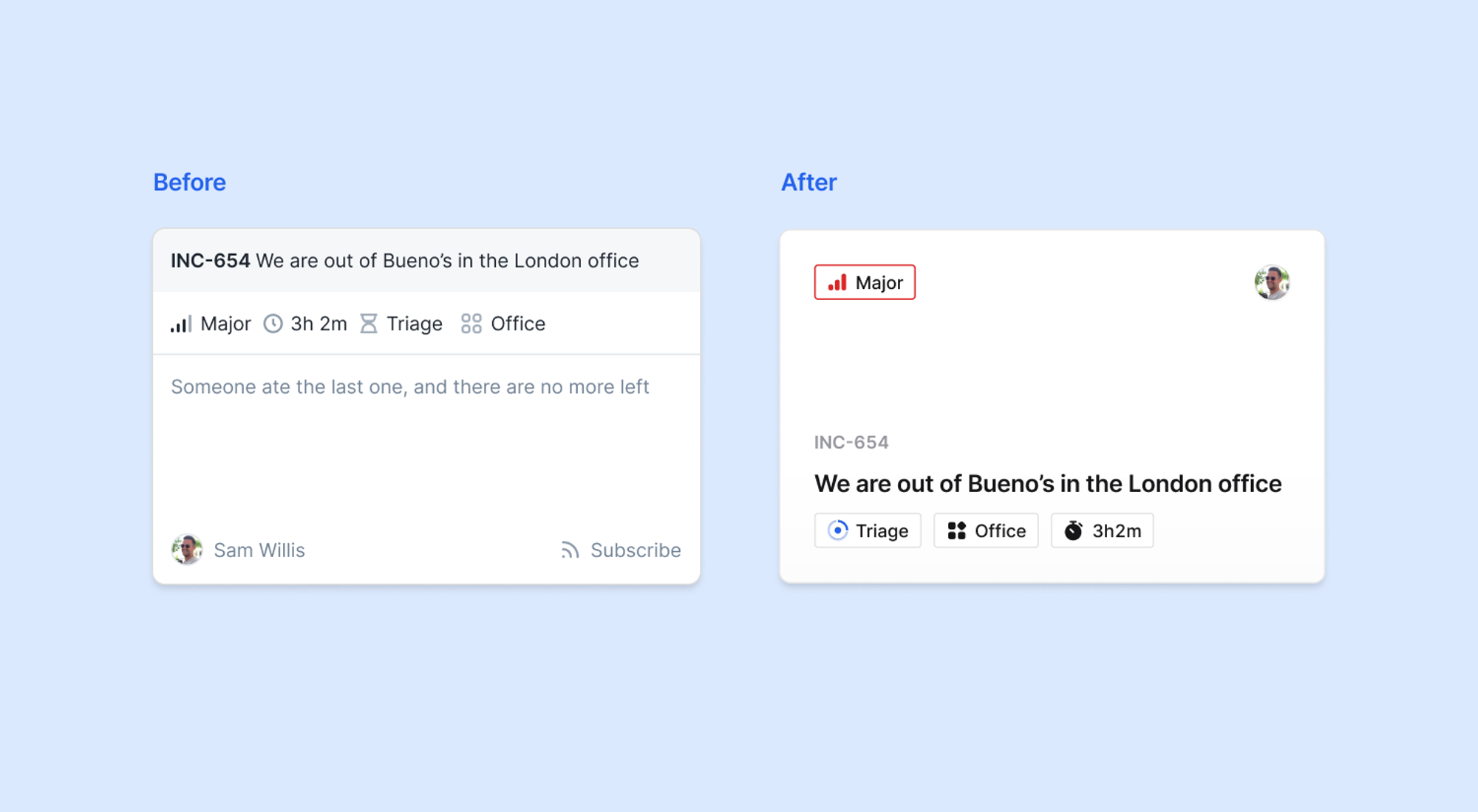
Smart hover states reveal more information when you need it, so you’re not bombarded with everything in one go.
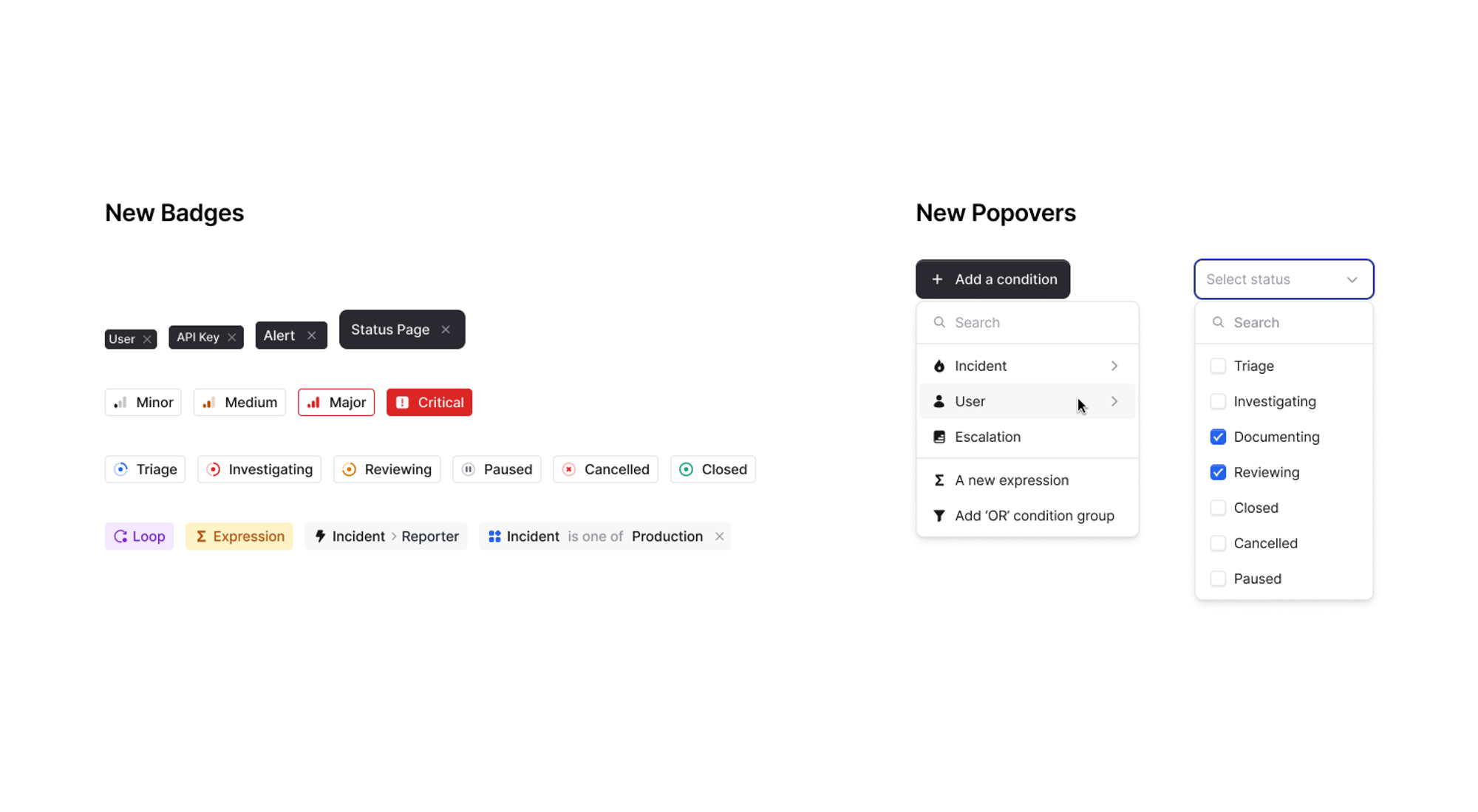
Sweating the small stuff
We’ve spent extra time to get the details just right on our most used components, like badges and popovers. This makes doing anything in our app, like setting up Workflows or filtering Insights, faster and easier.
Highlights include clearer badges and icons for incident status and severity, and checkboxes in popovers for when you want to filter by more than one item.
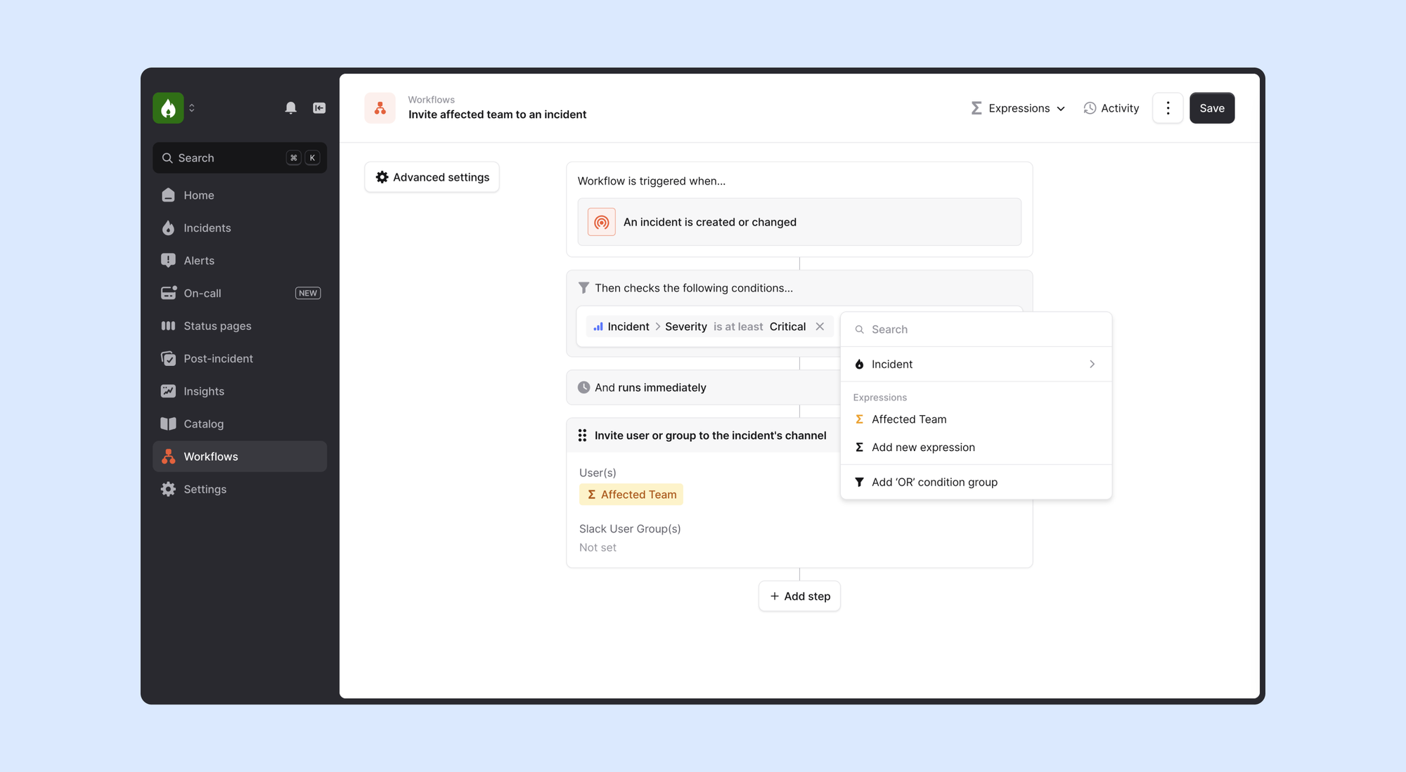
Here’s editing a condition on a Workflow in action:
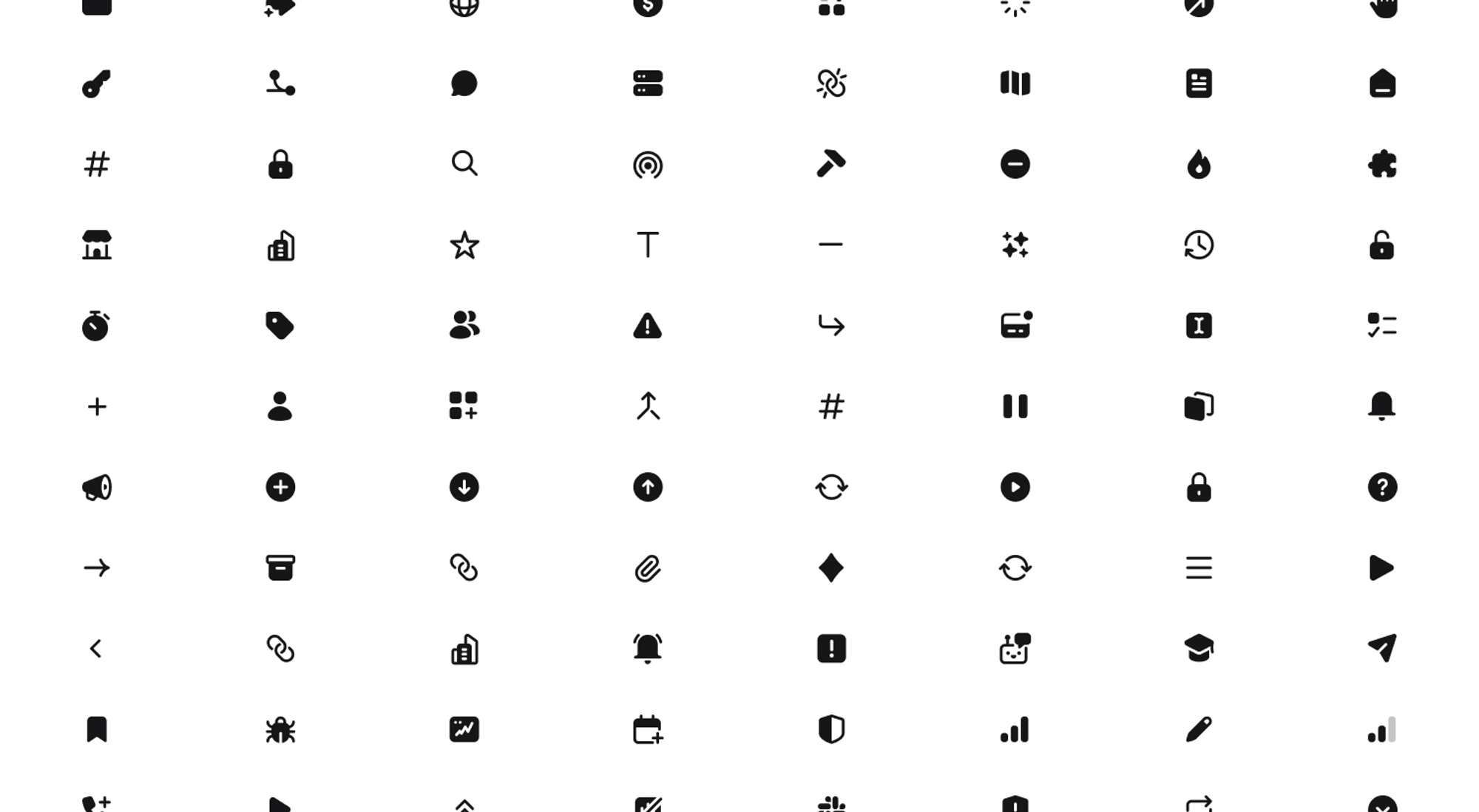
Upgraded icons
On top of that we’ve replaced every icon in the dashboard. The new set uses bigger shapes that are filled with color — this makes them easier to scan, especially at small sizes.
🚀 What else we’ve shipped
Improvements
- Our "cancel incident" screen reduces confusion by no longer saying both "Cancel" and "Cancel incident"
- Attached Sentry issues that contain HTML now render in a much nicer way
- Incident updates with nested bullets now render properly in Slack
- Fixed an issue where alert descriptions were overflowing in our alerts list
- We'll now create a new alert for every permutation of your
groupLabelswhen sending an alert via SNS from AWS Managed Grafana
Bug fixes
- Fixed an issue where schedule previews would display incorrectly when applying an override
- Fixed an issue where you were unable to change a backlink's "Multi-value" toggle
- Fixed a small off-by-one error where we included an extra day in some date filters
- When editing a workflow, the "You have unsaved changes" warning now works properly
So good, you’ll break things on purpose
Ready for modern incident management? Book a call with one of our experts today.
We’d love to talk to you about
- All-in-one incident management
- Our unmatched speed of deployment
- Why we’re loved by users and easily adopted
- How we work for the whole organization


