Design Details: On-call
March 15, 2024 — 6 min read

On your bedside table sits a piece of software designed to wake you up. It loves bothering you when something goes wrong — and making it your responsibility to sort it out
Meet the new incident.io On-call app. We designed it this way: to be as interruptive as possible. Whether you’re watching telly, at the gym, or as mentioned, fast asleep, it’ll get you. Got called even though you’re in silent mode? Great! We’ve done our job properly.
For the uninitiated, on-call software is used when you're responsible for addressing any incidents that arise in a given area (usually software) — often outside of office hours — and need reliable alerting to reach you. It can be… intense.
In this post, we’ll look at some of the key questions that accompany these feelings, and highlight the design decisions we made to try and move users beyond the adrenaline spike of urgency, and instead create something that brings clarity and calm to high-pressure situations.
Let’s take those questions one at a time.
“Is anything on fire?”
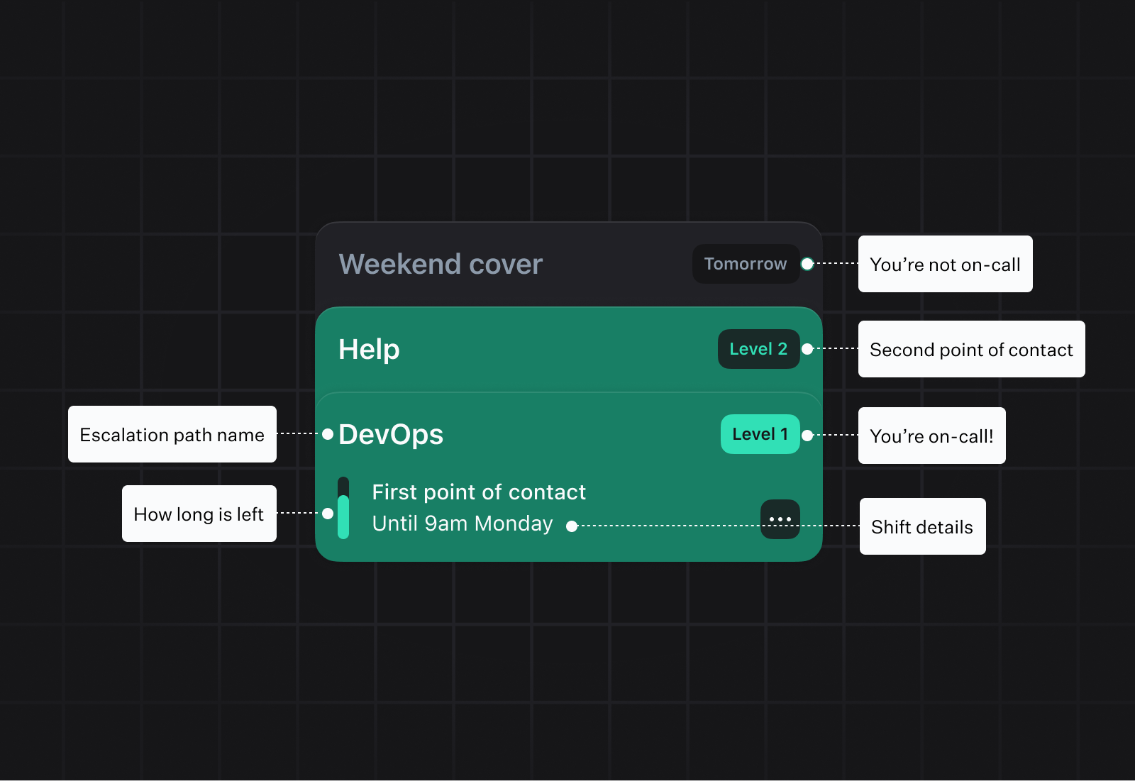
Unless you’ve been paged (more on that later!), the questions people typically asked were about their on-call schedule: 'Am I on-call now?', 'When am I next on-call?', and 'Is anything on fire?'. We needed a home screen that would address these at a glance.
After exploring various approaches, we settled on a card metaphor to represent each escalation path (the chain of people that will be notified when something's up) a user is present on. This would allow us to deal with a wide range of use and edge cases, and carefully prioritize information so things never felt overwhelming. Or so we thought.
Settling on this approach was the easy part. The real work came in addressing the aforementioned edge cases. What if a user is on multiple paths? What if they don’t do shifts per se, but instead are always the second point of contact? What if they’re the second point of contact, but no one is currently the first? Our initial designs went from fun and simple, to complex and content-heavy as we unearthed more and more real-life requirements.
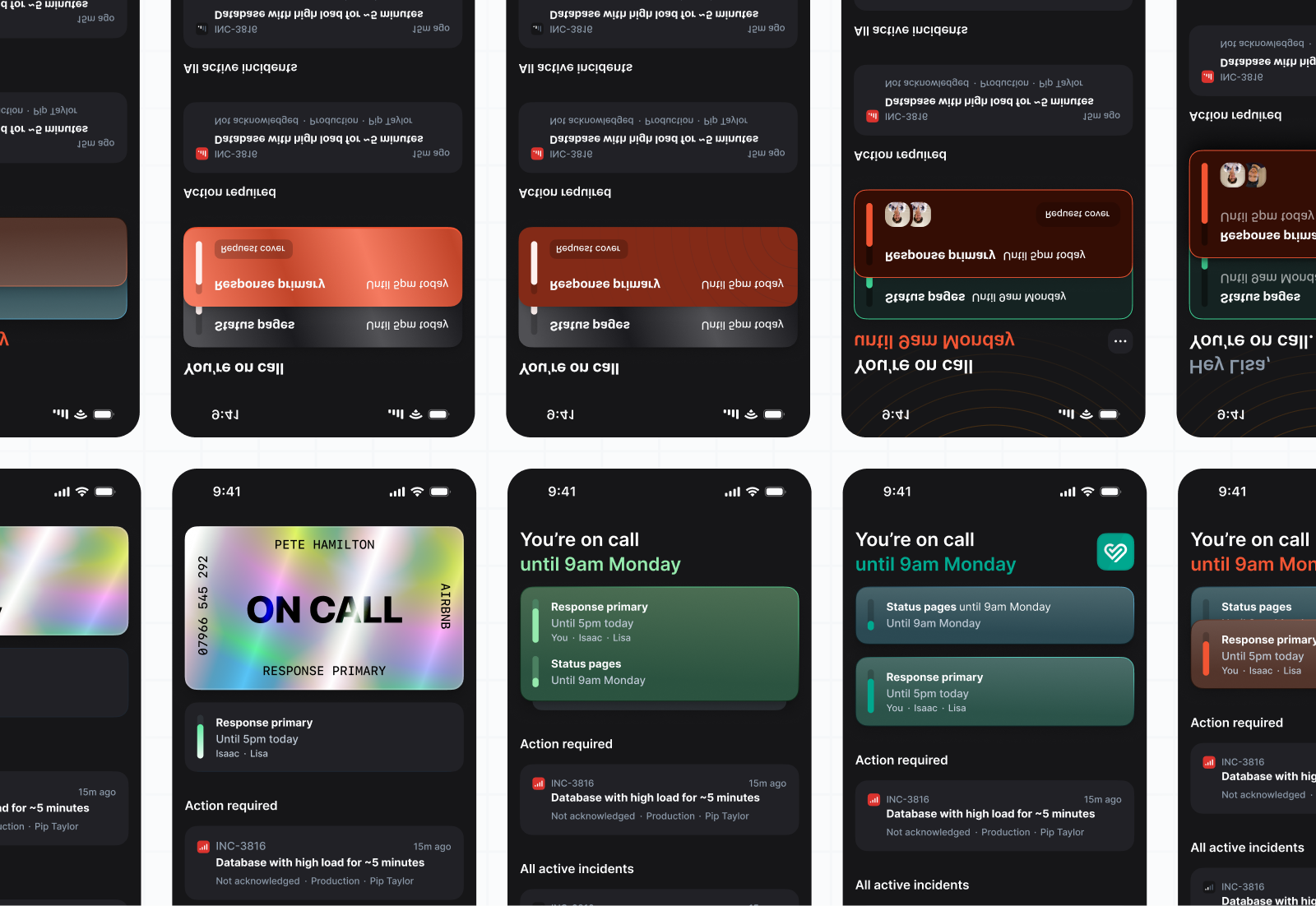
In the end, we were able to go back to basics and create an expanding set of cards that (a) could be read at a glance — even when collapsed — and (b) told you everything you needed to know, but nothing more.
It also meant the cards could expand and collapse in an oh-so-satisfying way.
“Will I definitely get paged?”
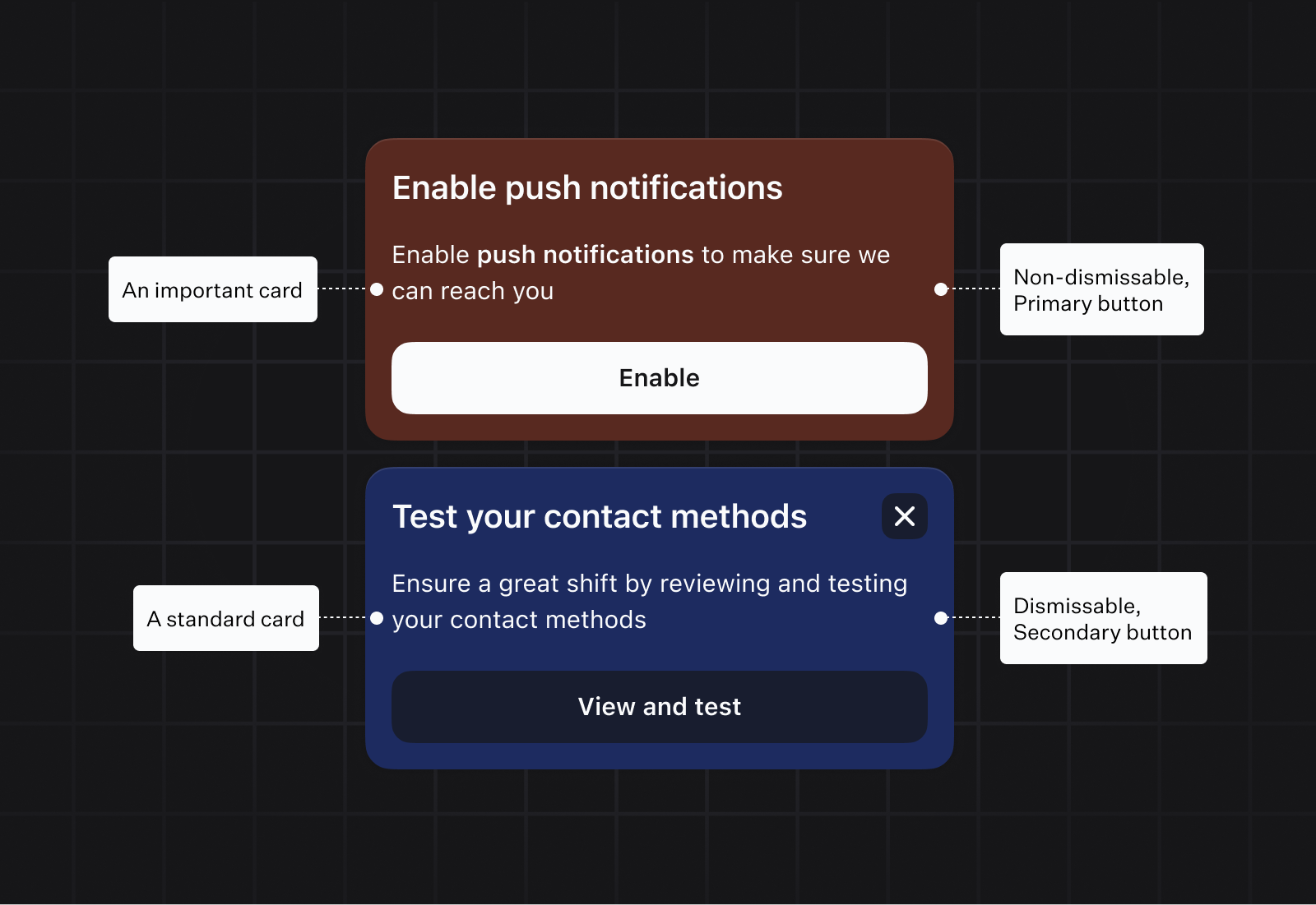
This mirrors what teams experience during on-call engineer onboarding: when setting up for the first time, it's totally normal to wonder if you'll actually get notified — especially given the maze of permissions, silent modes, and Do Not Disturb switches.
For peace of mind, we created a system of nudge-cards that encourage users to test their notifications before going on-call for the first time, and prompt them when something may not be configured correctly. These held the same basic styles as the on-call cards (think corners, bevels etc.), but had their own level of priority, depending on how important we believe the task to be.
“Urgh what’s that noise?!”
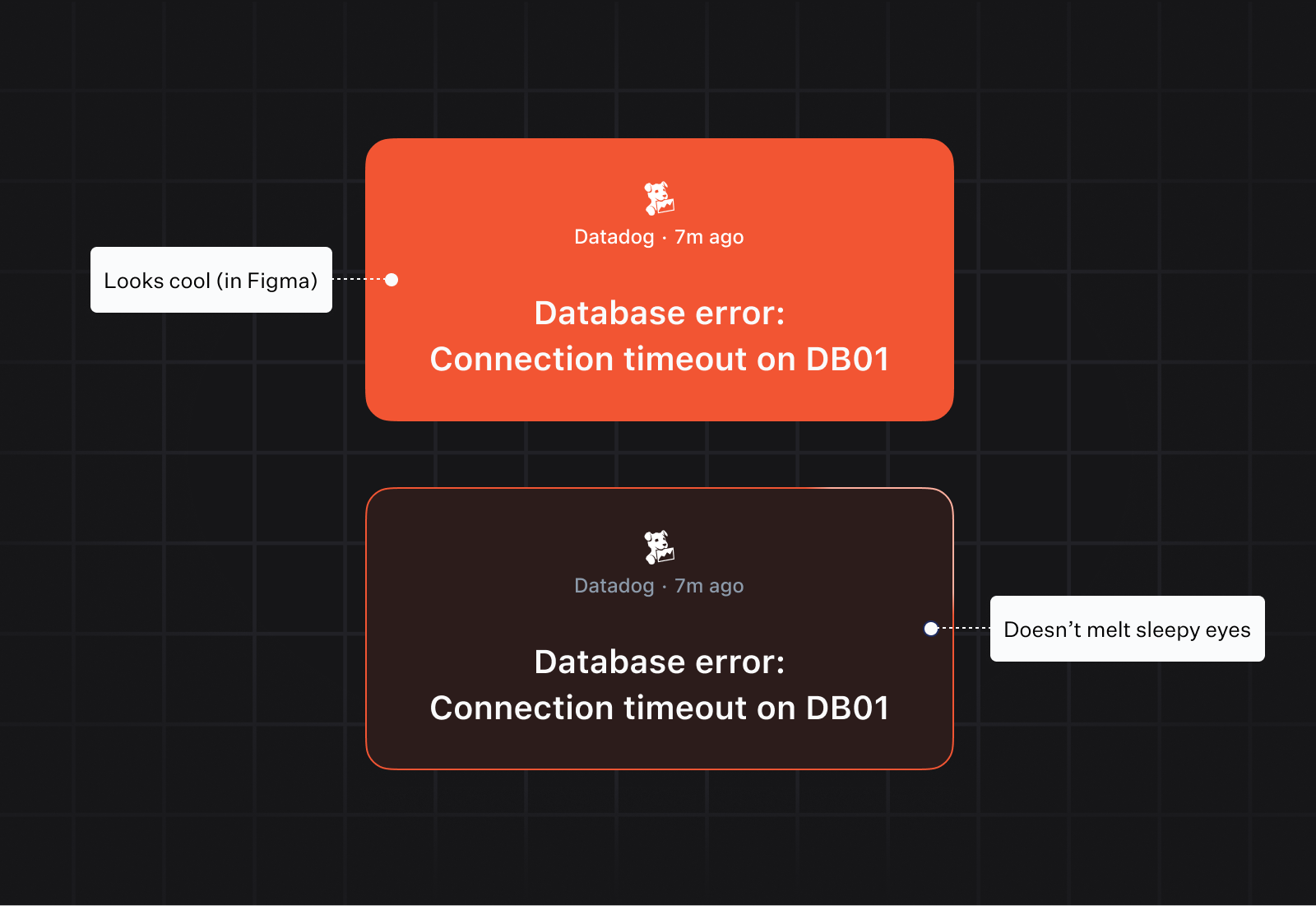
It’s 2am. The s has hit the f, and you’ve been notified. Game time. We talked to lots of engineers to understand how this feels in the moment.
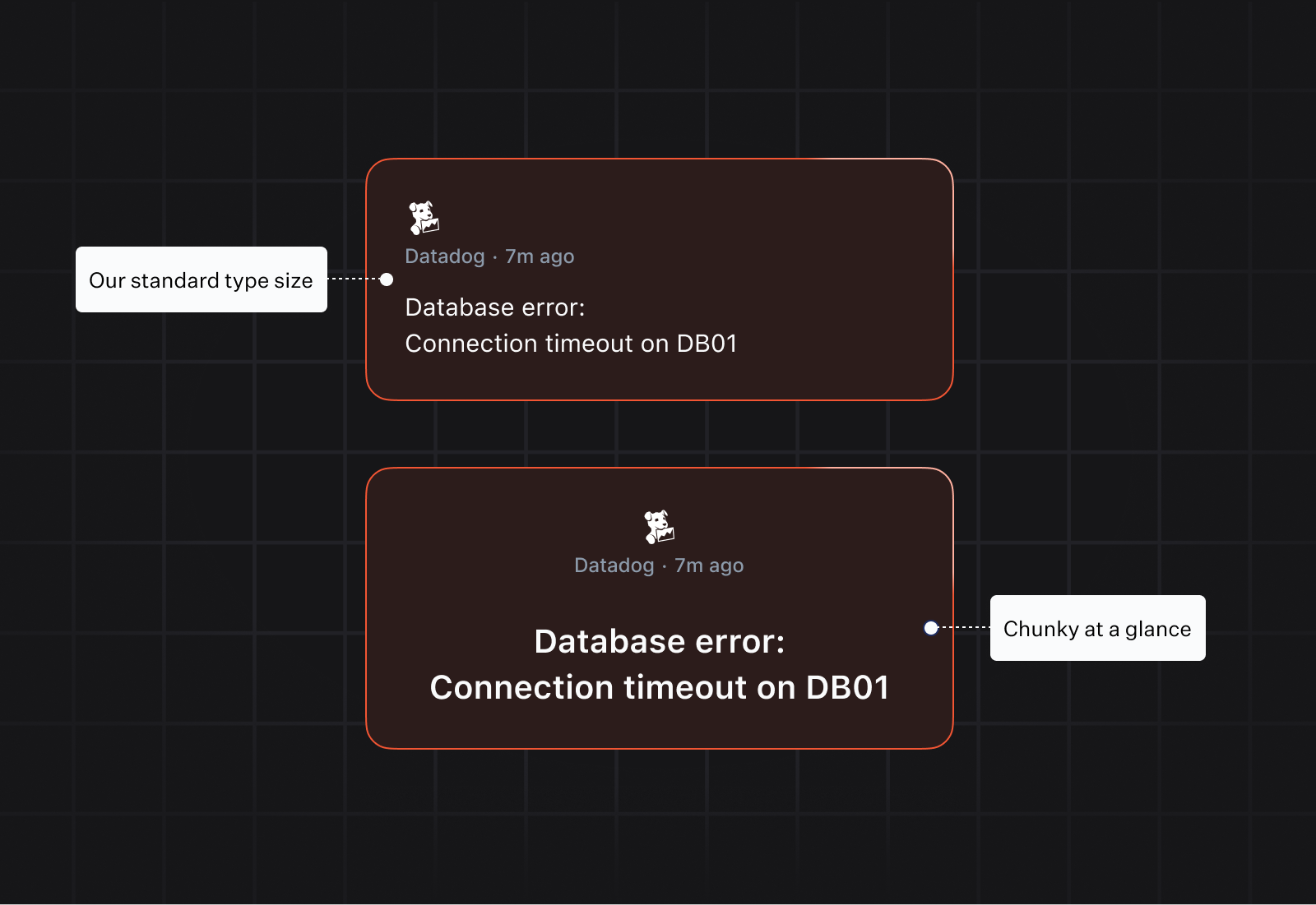
First up: shock. You’ve just woken up! It’s so bright! To combat this, we settled on dark mode by default, and only apply subtle fills on the alert screen. It’s pitch black and we don’t want to blind you before you can do your job. Take a look at the two examples, and imagine which one you’d rather be woken up by.
We also broke out of the type styles used elsewhere, and a introduced large text style, showing only the content of the notification. What we want you to do here is acknowledge (or not!), and then get into the details. Again, take a look at the examples below. The small text might look a bit neater, but in testing, it’s much harder to glance at and understand.
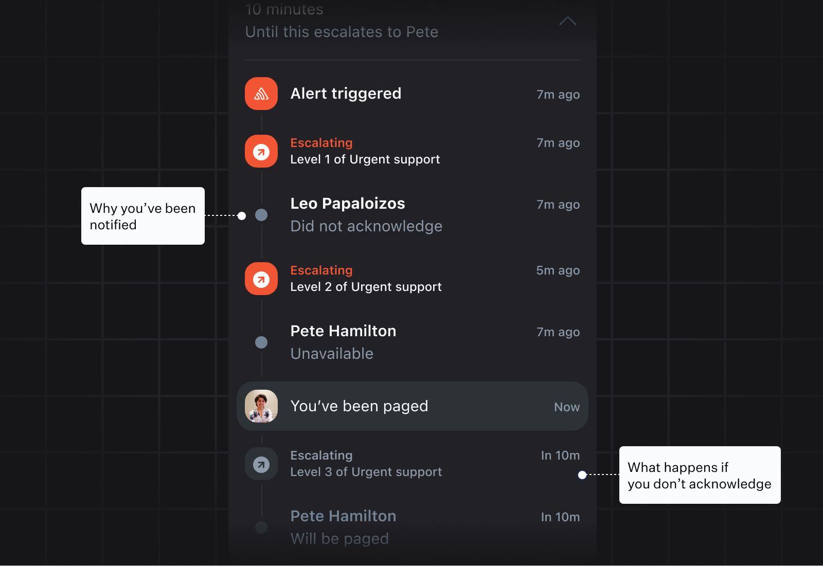
“Why have I been paged?”
Usually, the reason for the notification is in clearly spelled out in the alert, but in the case that you’re the second, or third point of contact, you might need more information: ‘Did someone not acknowledge?’ Why not?, ‘Has someone escalated to me?’ For this, we provide a simple timeline showing the history of the alert. We collapse this by default to avoid overwhelming people when they’re under pressure.
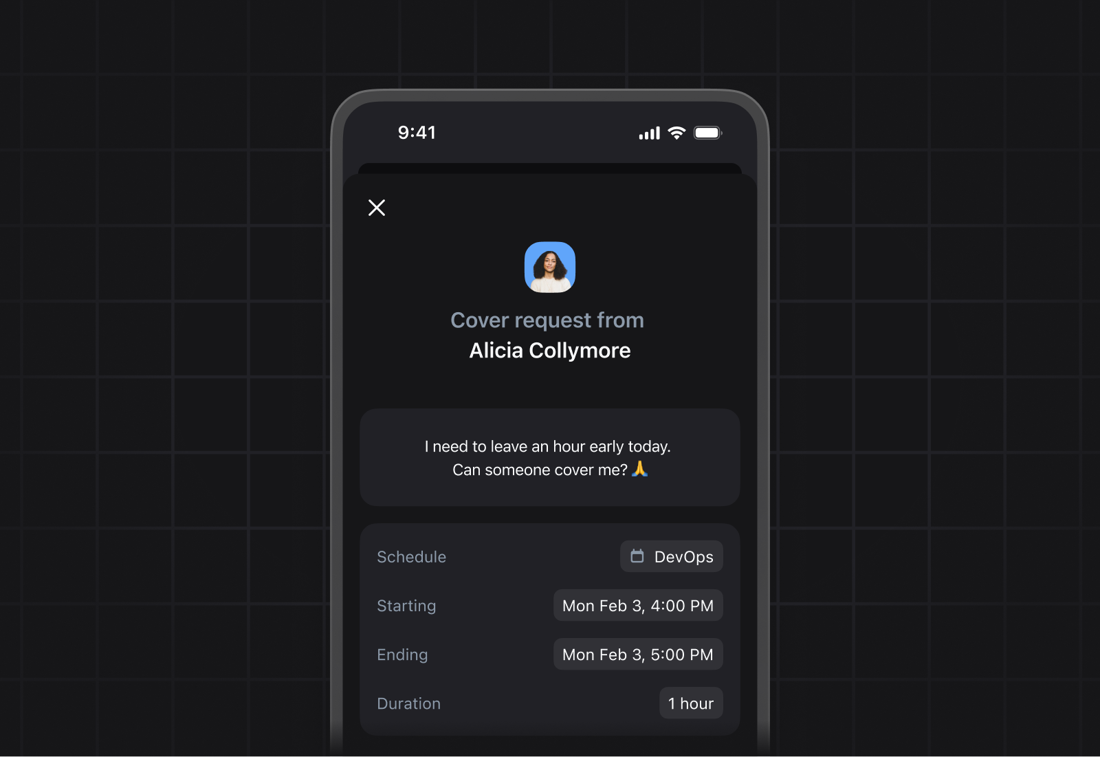
“Can someone cover me?”
As designers, there aren’t a lot of design emergencies, but we’re lucky enough to work in a company that has a lot of opinions about being on-call. Something we heard again and again was that there was no easy way to ask someone to cover for you for a bit. Maybe you’re out for the night. Maybe you just need to get a haircut. As described in being on-call at incident.io, cover requests used to happen in Slack channels and WhatsApp groups, with manual overrides created in dashboards once a deal was reached.
To address this we added a simple ‘cover me’ feature. A user simply selects the escalation path, picks a time, and their team will be notified.
It’s a small lift, but something that gets at the heart of what we’re trying to do here — treating users like people, and not webhooks.
If you like what you see, try it here and see how it feels to go on call with us!

Tom Petty
Product Designer
See related articles

Your genie is vanishing: introducing the Opsgenie rescue program
Today, we're launching the Opsgenie Rescue Program to make that landing soft: simplified migration and free overlap so you never pay two vendors at once.
 Tom Wentworth
July 9, 2026

De-risking a PagerDuty migration: the objections we hear most, and how to clear them
Often, switching on-call platforms isn't a technical challenge but a human one. In this post, we break down the seven objections engineering teams raise most often when considering a PagerDuty migration, and share exactly how to address each one.
 Eryn Carman
June 9, 2026

Customers over control: how we measure On-call reliability
Instead of thinking about reliability as an exercise in figuring out what we can control, and ignoring anything beyond that, we think about what we'll be really proud to offer to customers.
 Mike Fisher
May 28, 2026
So good, you’ll break things on purpose
Ready for modern incident management? Book a call with one of our experts today.
We’d love to talk to you about
- All-in-one incident management
- Our unmatched speed of deployment
- Why we’re loved by users and easily adopted
- How we work for the whole organization

